# Using SVGs
Instructions for adding Font Awesome icons as SVG files in desktop environments.
> SVGs are right at home in vector-based design apps where you can resize and color with ease.
Make sure you already:
- [Downloaded the Font Awesome Desktop files](https://fontawesome.com/download).
- Located the `.svg` files for the icons you plan to use in the `/svgs/` or `/svgs-full` folder.
You can drop any one of our SVG files into vector-friendly design apps like Figma, Sketch, or Adobe Illustrator, just to name a few. Create a new file or open an existing one, and drag the SVG into the artboard where you would like it placed.
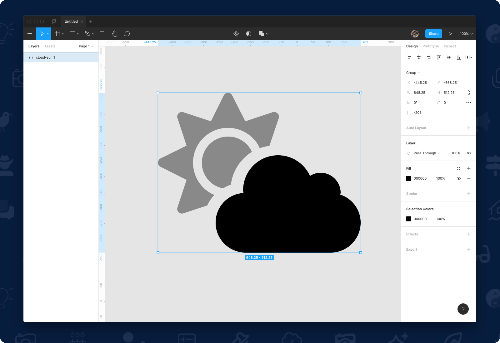 A duotone icon's .svg file open in Figma
Then use the app's tools for resizing and coloring to get it just right in your design.
### Using Kit Custom Icons as SVGs
If you [downloaded a Kit with custom icons](/desktop/setup/kit-download.md), the download will include the processed SVG files derived from your original SVGs. You can use these just like you would any of the other Font Awesome icons.
A duotone icon's .svg file open in Figma
Then use the app's tools for resizing and coloring to get it just right in your design.
### Using Kit Custom Icons as SVGs
If you [downloaded a Kit with custom icons](/desktop/setup/kit-download.md), the download will include the processed SVG files derived from your original SVGs. You can use these just like you would any of the other Font Awesome icons.
A Word to the Wise
When you add an SVG file, you are making direct edits to the SVG, so we recommend saving any changes you make in a new file and keeping files organized for future use.
## SVG Formats
Font Awesome provides two different sets of SVG assets:
| Assets | Folder | What's the difference? | Impact on Rendering |
| --------- | ------------ | --------------------------------------------------------------------------------------------------------------------------------------------------------------- | ------------------------------------------------------------------------- |
| SVGs | `/svgs` | SVG `viewbox` `width` is cropped to the edges of the interior symbol. The `viewbox` has a standard `height` based on the [Icon Canvas](/web/style/icon-canvas.md). | Icons will only take up as much space as their dimensions need. |
| Full SVGs | `/svgs-full` | SVG `viewbox` `width` and `height` are set to a standard square based on the [Icon Canvas](/web/style/icon-canvas.md) | Icons will be rendered at a consistent width with surrounding whitespace. |
## Duotones and SVG
Just like any other style of Font Awesome icons, you can drag and drop a Duotone SVG file into your SVG-friendly application, and the duotone icon will appear. By default, the secondary layer will be set to 40% opacity and the icon will be set to a single color, but you can change that.
#### Changing Layer Colors and Opacity
To change the color or opacity in a Duotone icon, select and manipulate the opacity and color of individual layers in the SVG you opened. Here are a few examples in action.
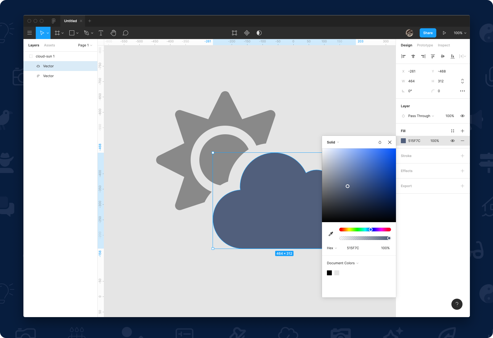 A duotone icon with a new color applied to the primary layer in Figma
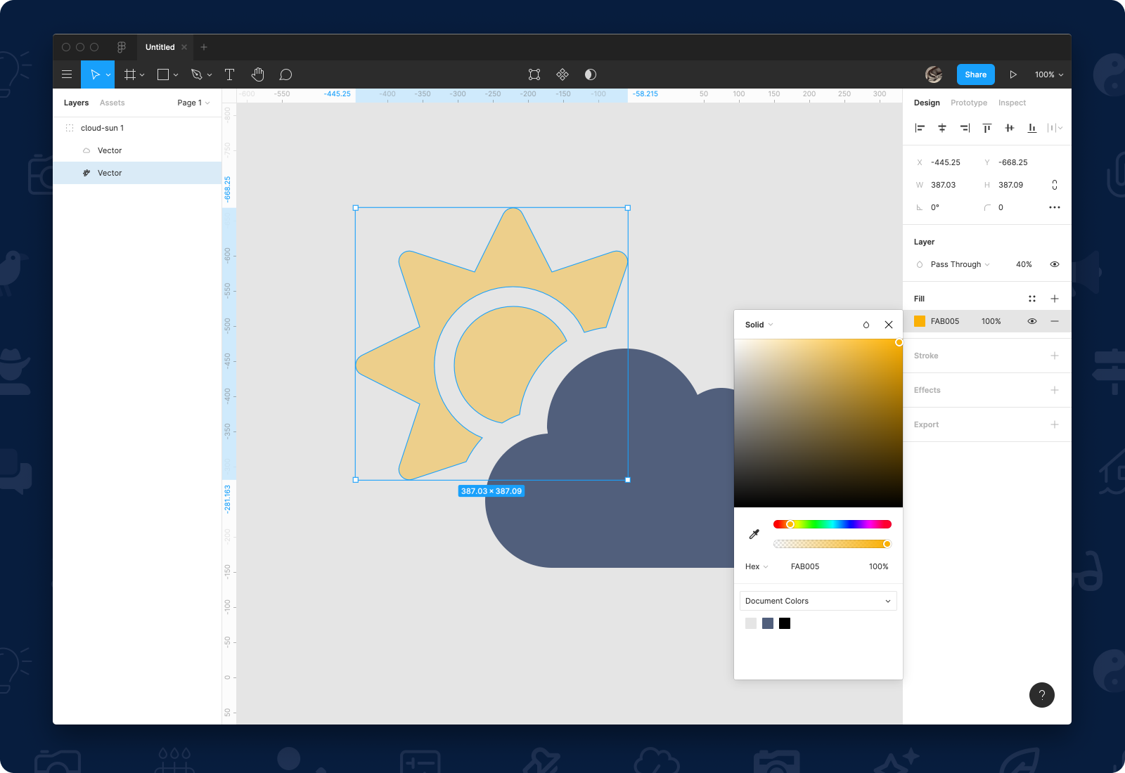 A duotone icon with a new color applied to the secondary layer in Figma
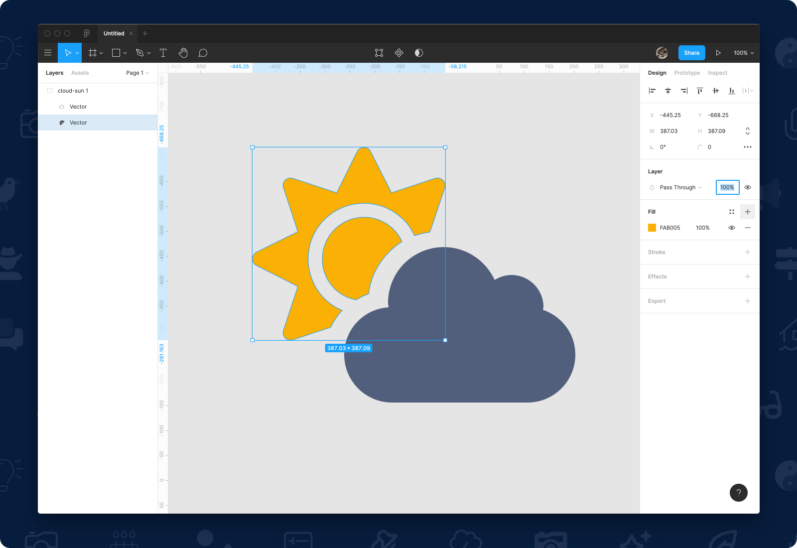 Setting opacity of a duotone layer to by adjusting the Pass Through in Figma