# Icon Design Guidelines
Guidelines and best practices for designing custom icons to upload to Font Awesome.
> With the help of a few key concepts, you can create great looking custom icons that will fit right in and be able to use all the awesome of Font Awesome.
Font Awesome has a lot of icons — like tens of thousands of icons! (Not even counting the magic made possible with the [Icon Wizard](/web/icon-wizard.md).) But even with that many tiny pictures, we don't have _everything_ (yet). Maybe you want to design and [upload your own](/web/add-icons/upload-icons/prep-icons.md).
So here are some tips, tricks, and best practices to bring your own icon creations to the Font Awesome party.
Need a jump start or template to get going?
Download the Font Awesome Icon Design Templates for Adobe Illustrator or Figma to get started with a proper
viewBox (a.k.a. Canvas), keyshape guides, and more useful examples.
## The Canvas
The skeleton of every icon set is its underlying grid system. When you [upload](/web/add-icons/upload-icons/prep-icons.md) your own icons to a kit, we'll translate them onto our Icon Canvas. We do this to ensure uploaded icons' size and appearance will look right at home when side-by-side with official Font Awesome icons. Using our grid and guidelines when designing your own icon goes a long way to making that translation accurate and easy.
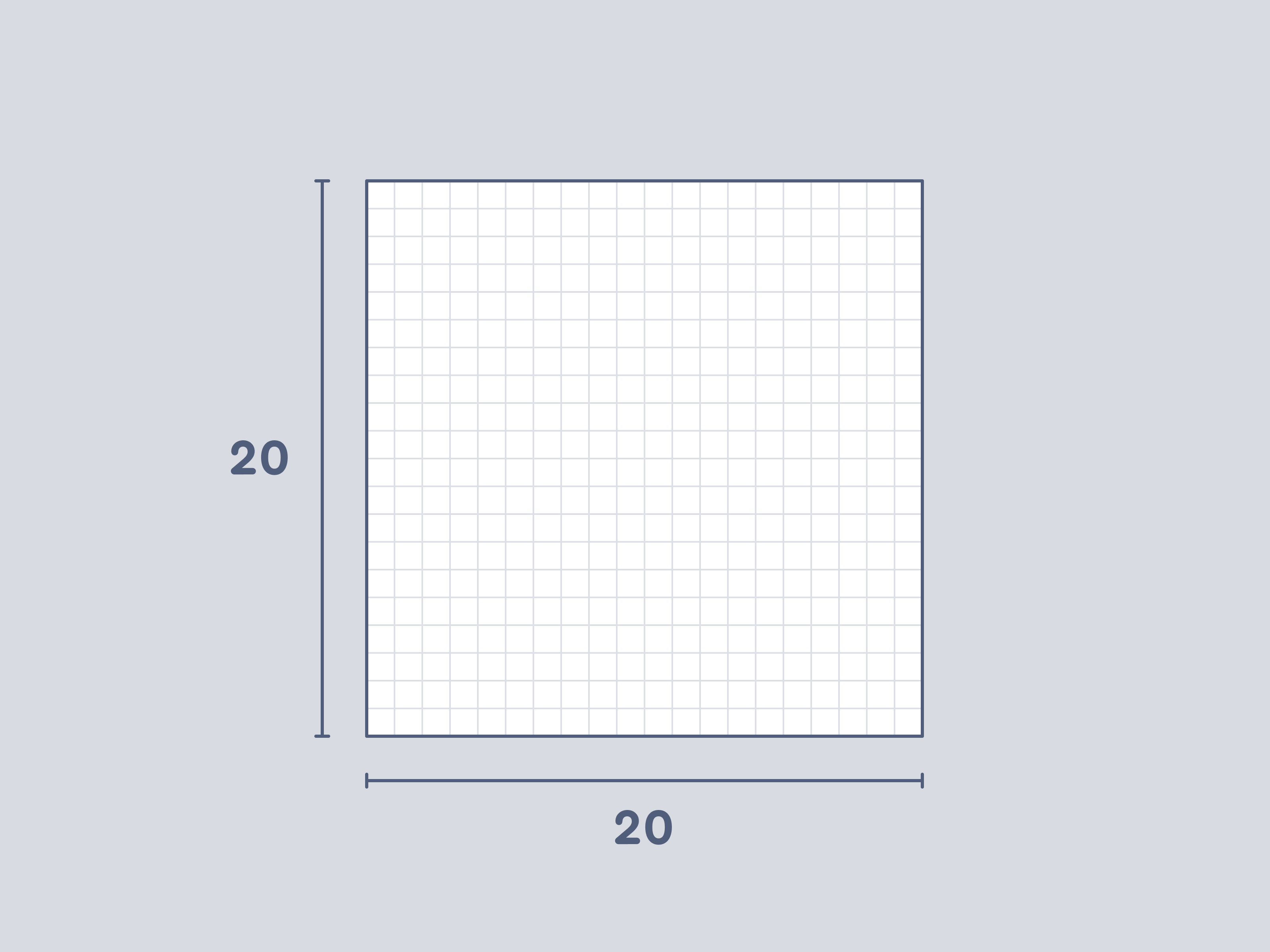 The Font Awesome 7 icon canvas is a standard square, measuring 20 × 20 pixels
Working with Wide Icons?
If you're designing icons that are **wider than the 20 pixel icon canvas**, which is common when uploading custom logos
for use as icons, be aware that they may render differently depending on how they're used.
[Learn more about how wide icons behave in different use cases](/web/add-icons/upload-icons/prep-icons.md#wide-custom-icons-and-rendering-behavior).
## Icon Design Best Practices
### Visual Balance
Keyshapes are guides that help keep our icons visually balanced, regardless of the orientation of their component parts. Most Font Awesome icons are based on a handful of core silhouettes: squares, circles, vertical rectangles, and horizontal rectangles. There are, of course, variants on all of these; but keyshapes help keep them balanced when seen and used together.
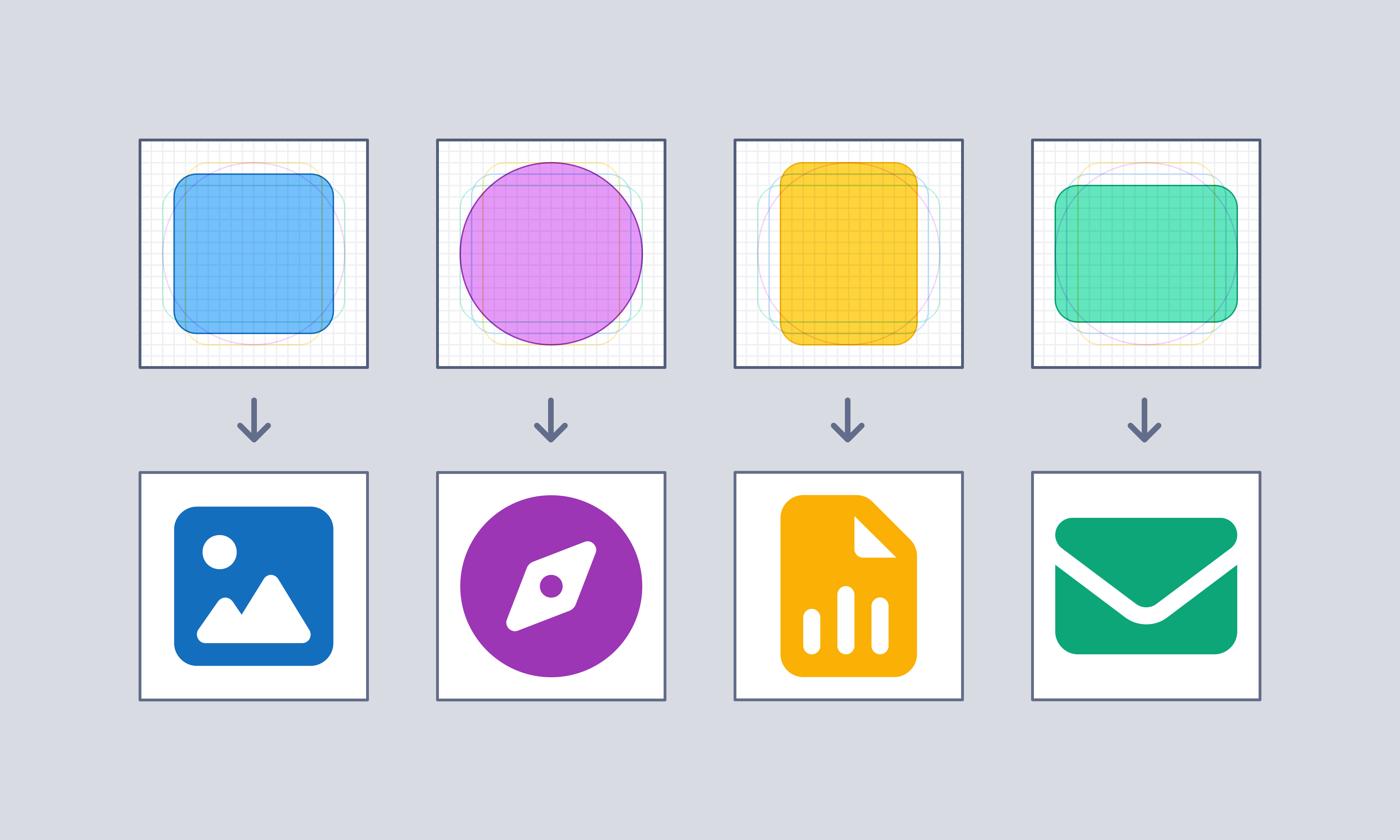 Our square, circle, vertical rectangle, and horizontal rectangle keyshapes paired with icons based on each
When making your own icons using our icon grid, you'll want to keep these shapes in mind and even recreate them directly as a starting guide.
| Keyshape | Size |
| :--------------------- | :---------------- |
| Square | 14 × 14 pixels |
| Circle | 16 pixel diameter |
| Rectangle (Vertical) | 12 × 16 pixels |
| Rectangle (Horizontal) | 16 × 12 pixels |
### Corners, Strokes, & Endcaps
Each core Font Awesome style has its own weight (just like typography), which you can reference below.
| Style | Stroke Weight |
| :------ | :-------------------------------------------------------------- |
| Solid | Filled shapes, with a mix of 2px (structure) and 1.5px (detail) |
| Regular | 1.5 pixels |
| Light | 1 pixel |
| Thin | .5 pixel |
Our square, circle, vertical rectangle, and horizontal rectangle keyshapes paired with icons based on each
When making your own icons using our icon grid, you'll want to keep these shapes in mind and even recreate them directly as a starting guide.
| Keyshape | Size |
| :--------------------- | :---------------- |
| Square | 14 × 14 pixels |
| Circle | 16 pixel diameter |
| Rectangle (Vertical) | 12 × 16 pixels |
| Rectangle (Horizontal) | 16 × 12 pixels |
### Corners, Strokes, & Endcaps
Each core Font Awesome style has its own weight (just like typography), which you can reference below.
| Style | Stroke Weight |
| :------ | :-------------------------------------------------------------- |
| Solid | Filled shapes, with a mix of 2px (structure) and 1.5px (detail) |
| Regular | 1.5 pixels |
| Light | 1 pixel |
| Thin | .5 pixel |
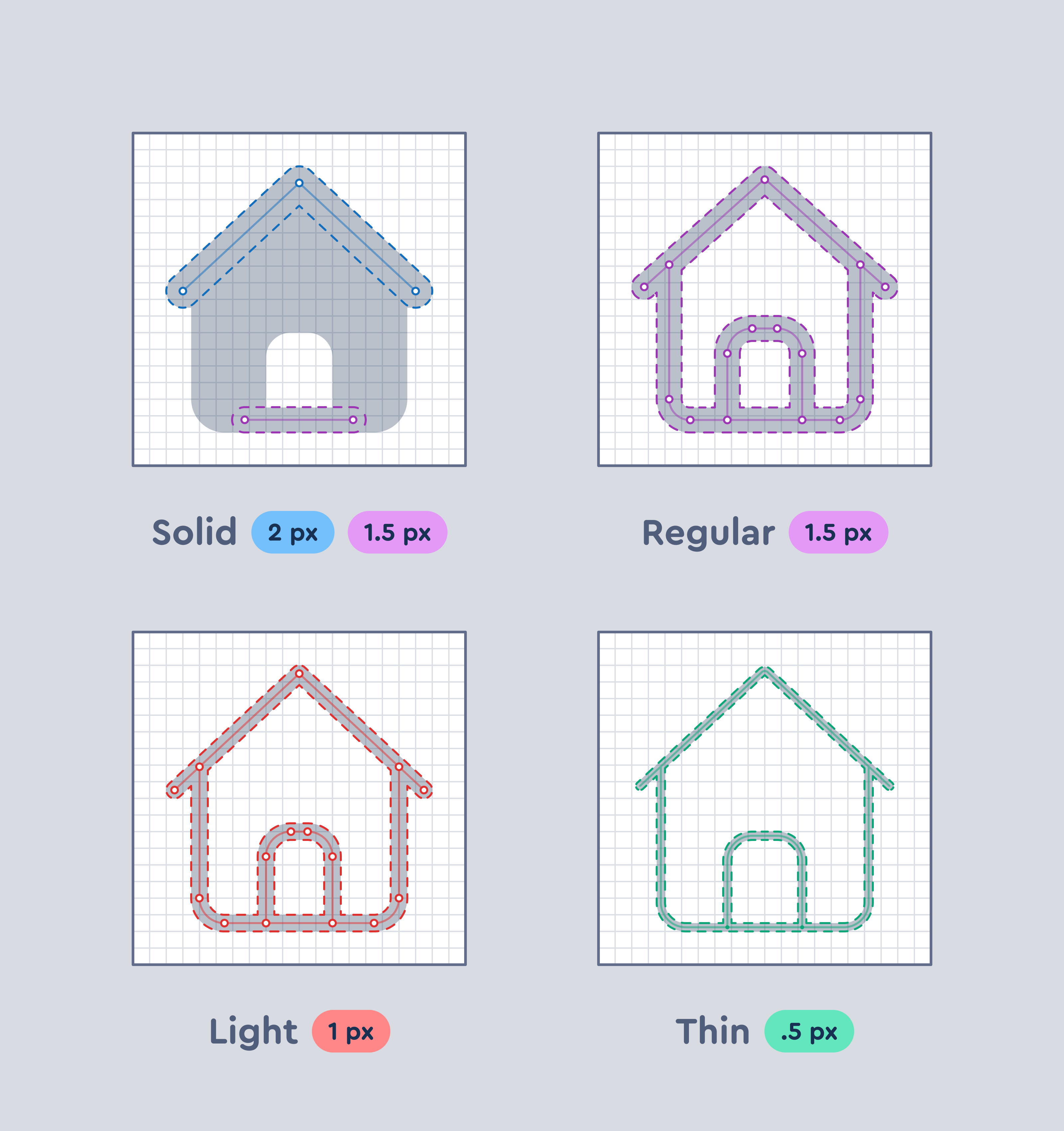 Different stroke weights used for our Solid, Regular, Light, and Thin styles
Similarly, the way that corners and the caps of stroked elements are handled depends on the family: Classic or Sharp.
Different stroke weights used for our Solid, Regular, Light, and Thin styles
Similarly, the way that corners and the caps of stroked elements are handled depends on the family: Classic or Sharp.
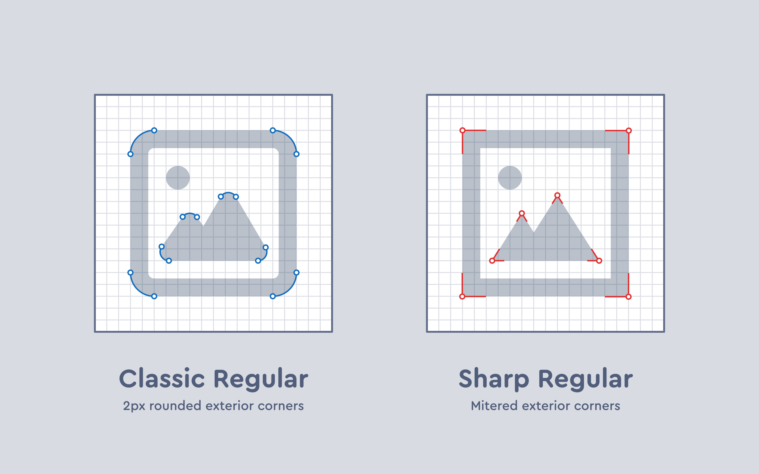 Corners for Font Awesome Sharp are, as advertised, much sharper
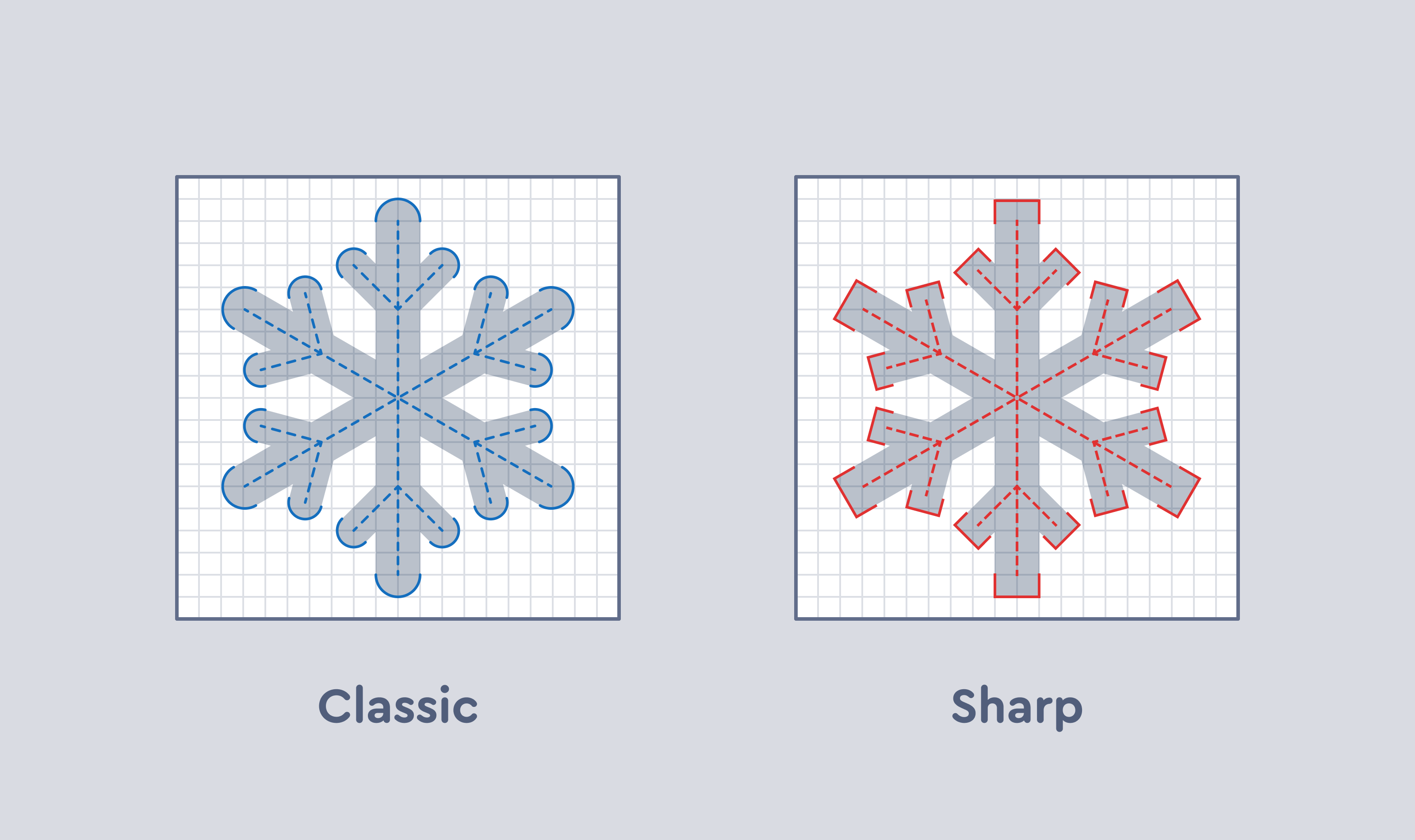 Don't get left out in the cold with mismatched endcaps!
### Overlaps & Cutouts
You can't always communicate complex concepts with singular elements or objects. A lot of our icons rely on juxtaposing two or more elements together, sometimes even on top of each other.
Across all Font Awesome styles, cutouts around shapes extend out 1.5 pixels for added legibility.
Don't get left out in the cold with mismatched endcaps!
### Overlaps & Cutouts
You can't always communicate complex concepts with singular elements or objects. A lot of our icons rely on juxtaposing two or more elements together, sometimes even on top of each other.
Across all Font Awesome styles, cutouts around shapes extend out 1.5 pixels for added legibility.
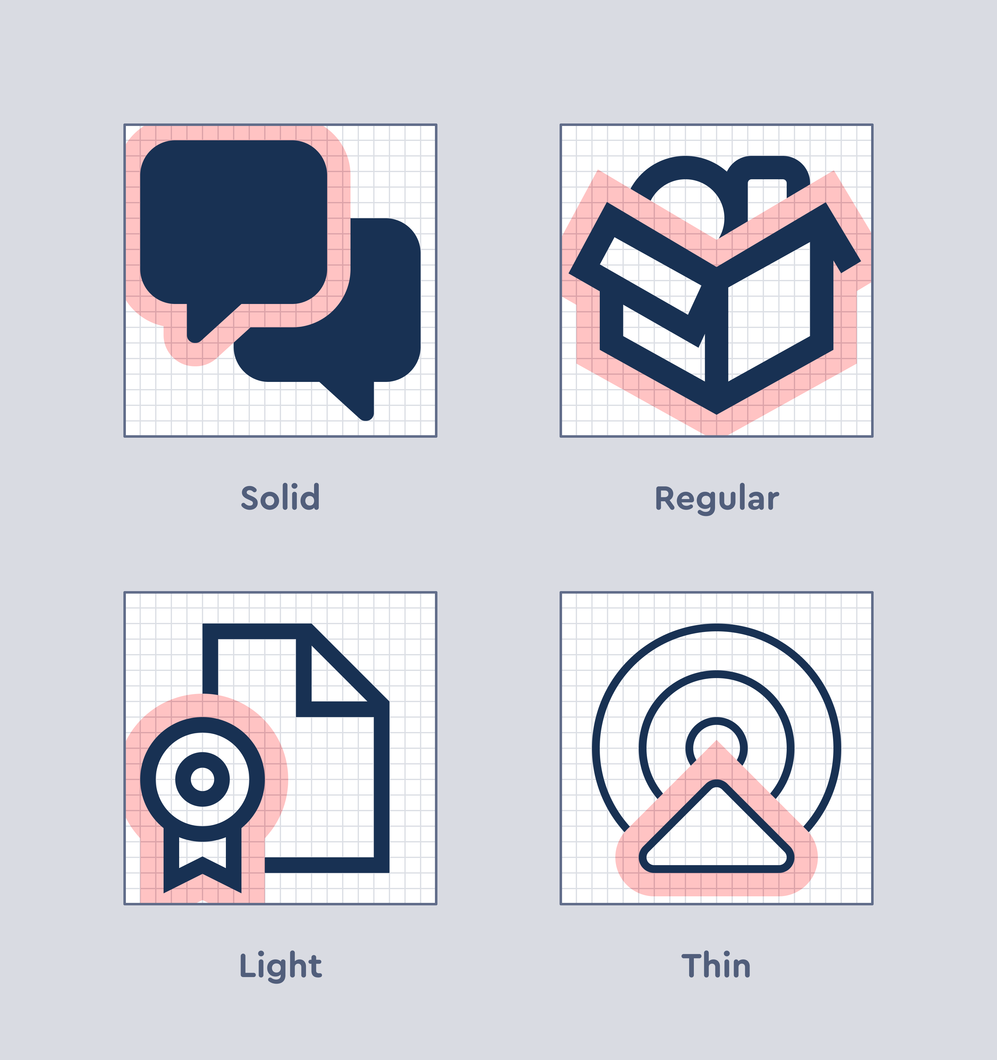 Overlap cutouts have a consistent width regardless of style -- 1.5 pixel safe zones around element overlaps
A notable exception is the standard `slash`, which only has a gap beneath it regardless of style.
Overlap cutouts have a consistent width regardless of style -- 1.5 pixel safe zones around element overlaps
A notable exception is the standard `slash`, which only has a gap beneath it regardless of style.
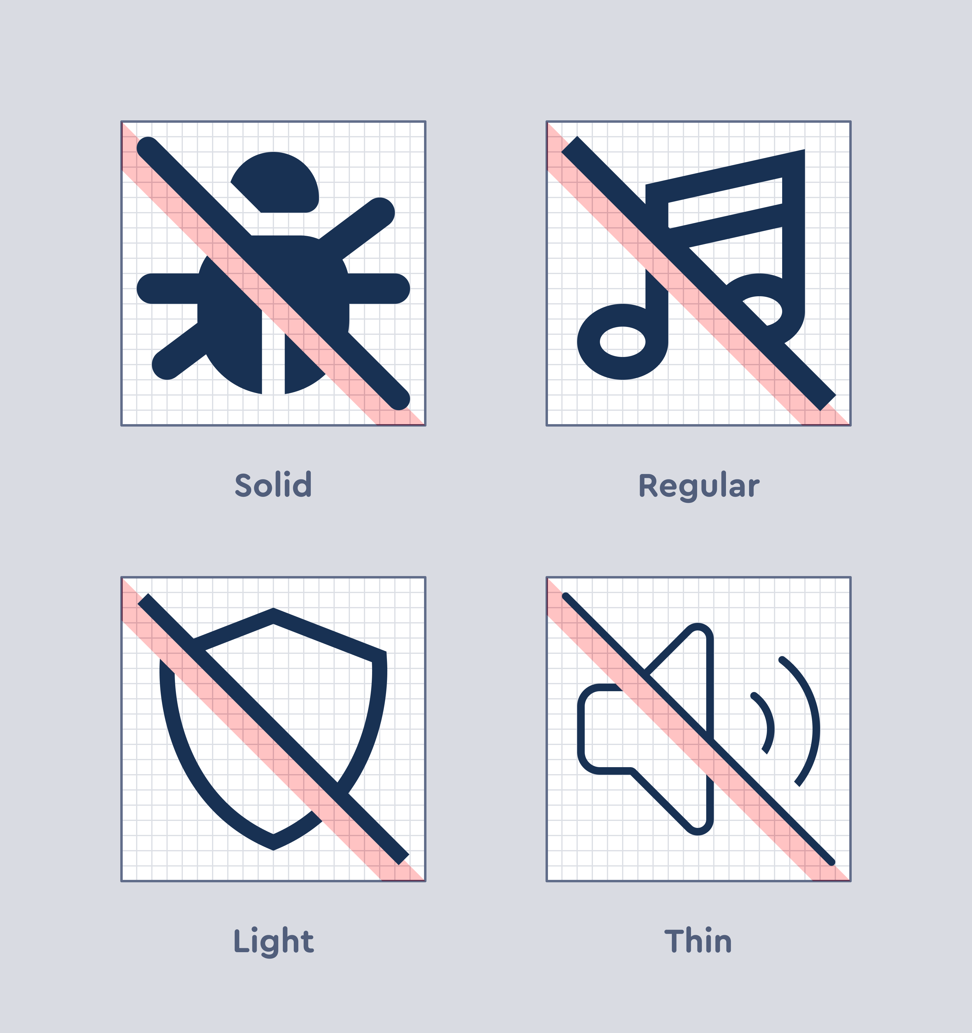 1.5 pixel cutouts below slashed elements