# Prep Icons for Upload
Instructions for preparing your custom icons before uploading to Font Awesome.
> So you've [designed your own perfect icons](/web/add-icons/upload-icons/icon-design.md), and now it's time to get them camera ready for their Font Awesome debut. There are many different paths to vector greatness — but to help your icons display nicely alongside our official ones, follow these requirements and recommendations when preparing them for upload.
Help Us Help You!
We take care of a lot of common SVGs issues on our end automagically, but **the closer you follow the steps below, the
more we can help** along the way. If your creations are still giving you a lot of issues during upload, check out our
handy-dandy [troubleshooting guide](/web/add-icons/upload-icons/troubleshoot.md).
## General Guidelines
### Valid SVGs
SVGs (or _scalable vector graphics_) are the only type of file we accept for custom icon uploads. In order for our system to parse those files correctly, there are a few required parameters to double-check:
| Requirements | Why? | |
| --------------------------------------------------------- | ----------------------------------------------------------------------------------------------------------------------------------------------- | --- |
| A `viewBox` attribute with `height` and `width` values | The `viewBox` attribute acts like an artboard or frame in your design software. It defines how much space an icon uses when rendered digitally. | |
| One (1) `path` element **OR** | For [monotone](/web/add-icons/upload-icons/prep-icons.md#setting-up-monotone-icons) icons | |
| Two (2) `path` elements (one of which has < 100% opacity) | To delineate the primary and secondary layers for [duotone](/web/add-icons/upload-icons/prep-icons.md#setting-up-duotone-icons) icons | |
As a quick example, here's our [solid circle icon](https://fontawesome.com/icons/circle?style=solid)'s valid SVG code:
```html
```
## Avoiding Rasters
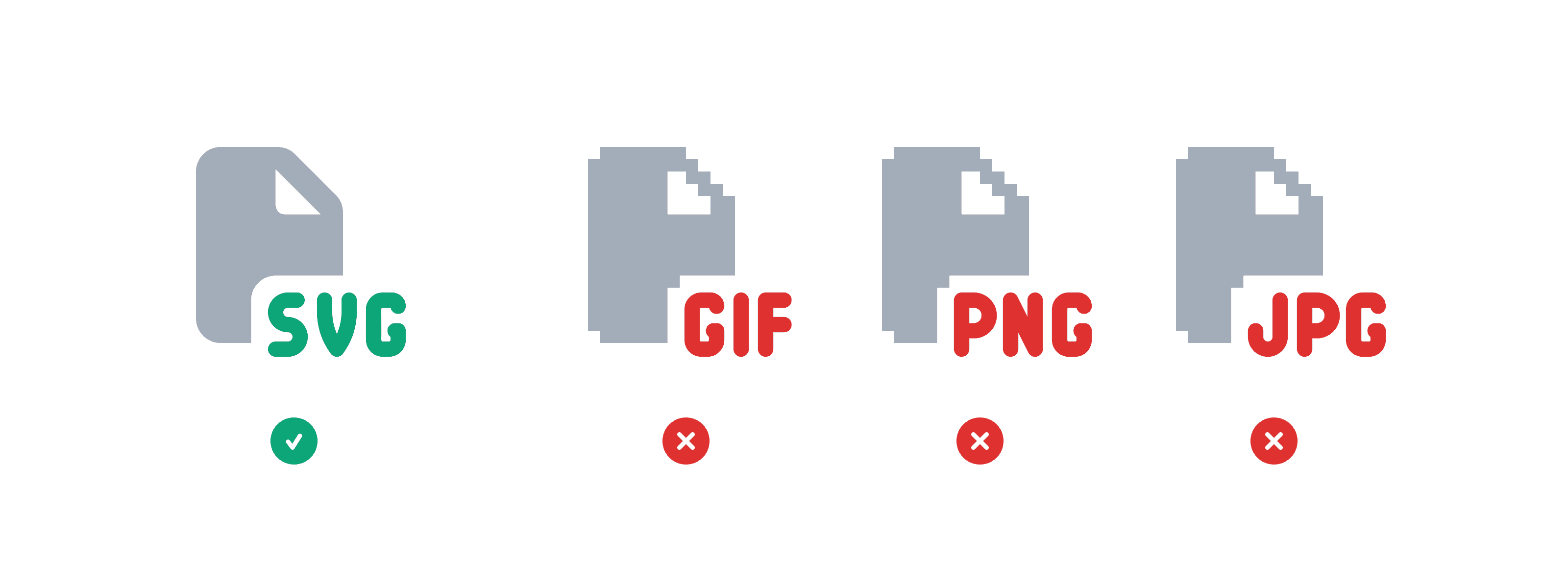
SVGs are a great medium for icons because they scale very well in almost any context. It's right there in the name! Conversely, raster (i.e. pixel-based) images like PNGs, JPGs, and GIFs do not. Because of this, raster images that are referenced in an SVG can bloat file sizes, and scale and render incorrectly.
Avoid rastering your SVGs
## Ins and Outs of Viewboxes
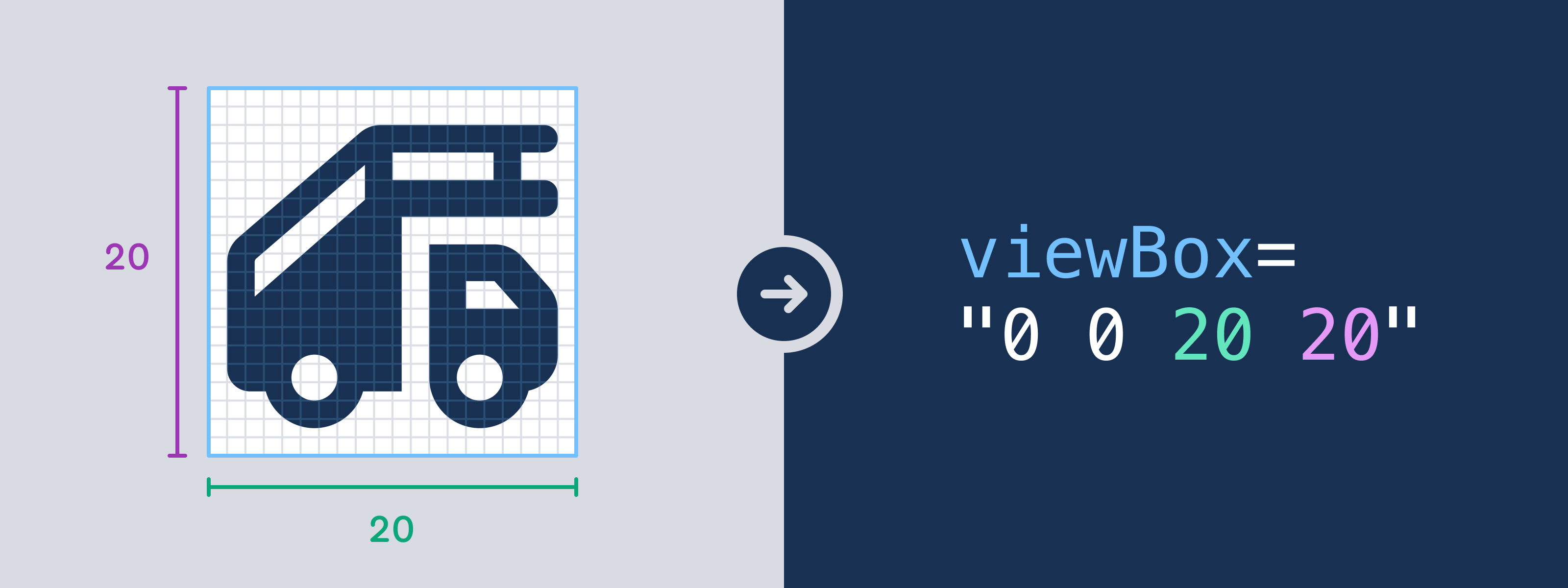
A `viewBox` attribute in SVG code is essentially an icon's canvas, informing both its size and alignment when it's rendered. The path data representing the icon itself needs to be be placed completely inside the viewBox with no points lying outside its boundaries.
If you're using design software to create icons, the `viewBox` attribute can be handily taken from the dimensions of your file's artboards or frames when exporting SVGs.
The width and height of an artboard or frame are directly translated into an SVG's boundary values
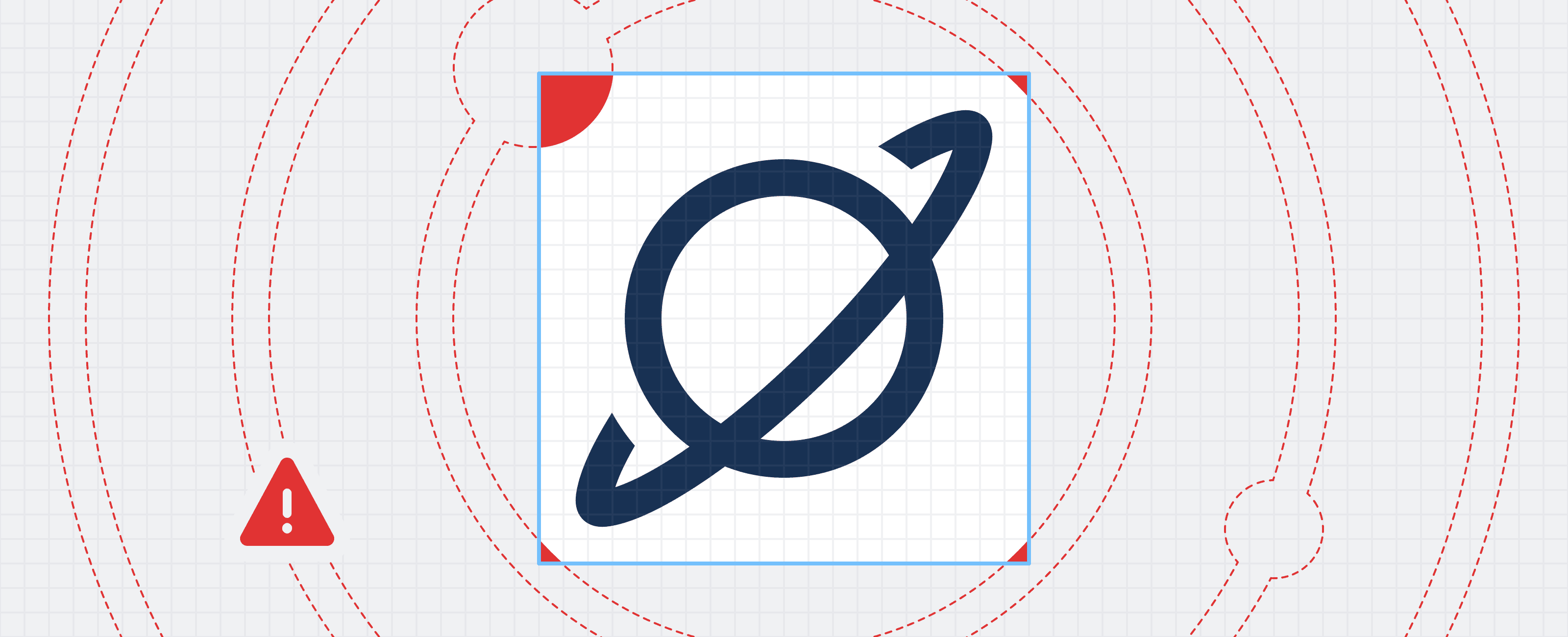
One of the reasons we [design our icons on a pixel grid](/web/add-icons/upload-icons/icon-design.md) is to ensure that things will render cleanly and crisply at a lot of standard sizes — and part of that is ensuring that no stray points or path data veer outside of the `viewBox`. Anything found outside or passing through the SVG's boundaries will be ignored or shunned during upload, so double-check your X and Y coordinates to keep everything nice and snug inside.
Any paths or points outside the `viewBox` will get left behind!
### Wide Custom Icons and Rendering Behavior
When uploading custom icons that exceed the width of the [20 pixel icon canvas](/web/add-icons/upload-icons/icon-design.md#the-canvas), it's important to understand how these icons will be rendered across different use cases and asset formats:
#### Using on the Web with Font Awesome's Core Software
When using Font Awesome's Software and Styling Toolkit on the Web, a wide custom icon will be scaled down to the same fixed width that Font Awesome's software applies to official icons. However, a wide custom icon that uses the `fa-width-auto` utility class will not be scaled down and will retain its original proportions.
#### Using Raw SVG Assets
When a wide uploaded icon is processed, its height is scaled (up or down) to fill a standard `viewBox` height – the equivalent of our 20 pixel icon canvas height. The icon's width scales in proportion to this updated height. The result is that the scaled width might extend beyond the icon canvas width.
Just like official Font Awesome Icons, Custom icons are then available in 2 SVG formats:
##### SVGs
This format is the result of the process noted above. The SVG conforms to a standard `viewBox` height and the width has been scaled up to maintain the original upload's proportions. The SVG's total width is based upon the width of its path(s) - no additional whitespace or scaling has been added.
##### Full SVGs
Full custom icons match the default rendering of official Font Awesome icons which are displayed on a fixed square 20 pixel icon canvas. After the previous scaling steps, a icon with a width larger than the 20 pixel icon canvas is scaled down to the boundary of the fixed icon canvas. To preserve the original aspect ratio, that icon's height is also scaled down. The icon is then vertically centered preserving any original relative whitespace.
## What About Colors?
While we can all agree that colors are rad, our system actually ignores those attributes to speed things along during the upload process. So don't worry about making sure all your SVGs are using the same hex code, or stripping out superfluous chromatic properties. You can use [our support styling to color your icon](/web/style/basics.md) to any hue you'd like once it's in your web project.
## Setting Up Monotone Icons
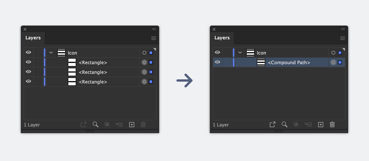
Most official Font Awesome icons are created from just a single SVG path. If your icon visually consists of multiple, separate shapes (e.g. stacked horizontal bars for a menu), you'll need to join them into a compound path (in [Illustrator](https://fontawesome.com/files/font-awesome-icon-template.ait)) or a boolean group (in [Figma](https://www.figma.com/community/file/1068599043365999834)).
Here's an example of how all those shapes get combined…
Combining your shapes into a compound path in Illustrator
Combining your shapes into a boolean group in Figma
…and here's how that looks in code from Illustrator:
```html
```
## Setting up Duotone Icons
But it's a great, big, beautiful icon world out there! (Figuratively, of course — these icons are actually quite small.) Some Font Awesome styles aren't limited to just one SVG path, and yours shouldn't be either. To create a Font Awesome-friendly duotone icon, you can follow the same steps as above, but just make sure you have **two** separate compound paths (Illustrator) or nodes (Figma).
Those paths will form the two separate pieces of your icon, but our system needs one extra step to know to handle them differently: **opacity**.
Font Awesome Duotone icons use two levels of opacity (one for each part of the icon) to tell which is the **primary** layer and which is the **secondary** layer. Your primary layer should have an **opacity of 100%**, but you can set the secondary layer's **opacity to anything less than 100%**.
Heads up!
Working with multiple SVG paths and opacities can be tricky. Whatever shape you set as your primary layer will be
"punched out" or subtracted from anything it overlaps. So to ensure that your Duotone icons come out as expected,
double-check that either:
the primary and secondary layers do not overlap **OR**
anything in your secondary layer that does overlap with the primary is fine being removed.
Diagram showing two separate pieces of a birthday cake icon, and how they don't overlap when combined -- two separate, non-overlapping paths for a duotone icon.
Diagram showing two overlapping pieces of a birthday cake icon, and how they interact when combined -- two separate, overlapping paths with a portion of the secondary layer being removed.
Regardless of how you decide to set up your opacity, the icon's secondary layer will be set to 40% once the icon is uploaded to match our Font Awesome icons. But after that, you can style it [however your heart desires](/web/style/duotone.md).
Combining your shapes into separate compound paths in Illustrator
Combining your shapes into separate nodes in Figma
Here's an example of the above Sharp Duotone as an SVG. Notice the two separate path elements and that the second one has `opacity=".4"`
```html
```
## Exporting Icons from Adobe Illustrator
Check out the Font Awesome Icon Template for Illustrator!
1. Start with each of your icon designs in their own artboards.
2. Outline any strokes with **“Object → Path → Outline Stroke,”** and any text with **“Type → Create Outlines”**
3. When you're done designing, use **“Object → Compound Path → Make”** to combine your icon into either:
- One compound path (for [monotone](/web/add-icons/upload-icons/prep-icons.md#setting-up-monotone-icons))
- Two compound paths (one at 100% opacity, and one at < 100% opacity for [duotone](/web/add-icons/upload-icons/prep-icons.md#setting-up-duotone-icons)).
4. Use **“File → Export → Export for Screens”**, select the artboards you want to export, and choose **“Format → SVG”**. Also, click the little gear icon and use these SVG settings:
- Styling: **Presentation Attributes**
- Font: **Convert to Outlines**
- Object IDs: **Minimal**
- Decimal: **3**
- Check **“Minify”**
- Uncheck **“Responsive”**
5. Export the artboards to the location of your choice.
6. Upload your icons to a [Font Awesome Kit](https://fontawesome.com/kits)! ([Learn more](https://youtu.be/x7MZH7AVM7c))
## Exporting Icons from Figma
Check out the Font Awesome Icon Template for Figma!
1. Start with each of your icon designs in their own frames.
2. Outline any text or strokes, unless you're including them as part of a boolean group.
3. When you're done designing, use one of Figma's [boolean operations](https://help.figma.com/hc/en-us/articles/360039957534-Boolean-operations) to combine your icon into either:
- One vector node (for [monotone](/web/add-icons/upload-icons/prep-icons.md#setting-up-monotone-icons))
- Two vector nodes (one at 100% opacity, and one at < 100% opacity for [duotone](/web/add-icons/upload-icons/prep-icons.md#setting-up-duotone-icons)).
4. Select your icon frame(s) and click the **“Export”** section in the right sidebar. Choose **“SVG”** from the dropdown, and export the frames to the location of your choice.
5. Upload your icons to a [Font Awesome Kit](https://fontawesome.com/kits)! ([Learn more](https://youtu.be/x7MZH7AVM7c))
 Avoid rastering your SVGs
## Ins and Outs of Viewboxes
A `viewBox` attribute in SVG code is essentially an icon's canvas, informing both its size and alignment when it's rendered. The path data representing the icon itself needs to be be placed completely inside the viewBox with no points lying outside its boundaries.
If you're using design software to create icons, the `viewBox` attribute can be handily taken from the dimensions of your file's artboards or frames when exporting SVGs.
Avoid rastering your SVGs
## Ins and Outs of Viewboxes
A `viewBox` attribute in SVG code is essentially an icon's canvas, informing both its size and alignment when it's rendered. The path data representing the icon itself needs to be be placed completely inside the viewBox with no points lying outside its boundaries.
If you're using design software to create icons, the `viewBox` attribute can be handily taken from the dimensions of your file's artboards or frames when exporting SVGs.
 The width and height of an artboard or frame are directly translated into an SVG's boundary values
One of the reasons we [design our icons on a pixel grid](/web/add-icons/upload-icons/icon-design.md) is to ensure that things will render cleanly and crisply at a lot of standard sizes — and part of that is ensuring that no stray points or path data veer outside of the `viewBox`. Anything found outside or passing through the SVG's boundaries will be ignored or shunned during upload, so double-check your X and Y coordinates to keep everything nice and snug inside.
The width and height of an artboard or frame are directly translated into an SVG's boundary values
One of the reasons we [design our icons on a pixel grid](/web/add-icons/upload-icons/icon-design.md) is to ensure that things will render cleanly and crisply at a lot of standard sizes — and part of that is ensuring that no stray points or path data veer outside of the `viewBox`. Anything found outside or passing through the SVG's boundaries will be ignored or shunned during upload, so double-check your X and Y coordinates to keep everything nice and snug inside.
 Any paths or points outside the `viewBox` will get left behind!
### Wide Custom Icons and Rendering Behavior
When uploading custom icons that exceed the width of the [20 pixel icon canvas](/web/add-icons/upload-icons/icon-design.md#the-canvas), it's important to understand how these icons will be rendered across different use cases and asset formats:
#### Using on the Web with Font Awesome's Core Software
When using Font Awesome's Software and Styling Toolkit on the Web, a wide custom icon will be scaled down to the same fixed width that Font Awesome's software applies to official icons. However, a wide custom icon that uses the `fa-width-auto` utility class will not be scaled down and will retain its original proportions.
#### Using Raw SVG Assets
When a wide uploaded icon is processed, its height is scaled (up or down) to fill a standard `viewBox` height – the equivalent of our 20 pixel icon canvas height. The icon's width scales in proportion to this updated height. The result is that the scaled width might extend beyond the icon canvas width.
Just like official Font Awesome Icons, Custom icons are then available in 2 SVG formats:
##### SVGs
This format is the result of the process noted above. The SVG conforms to a standard `viewBox` height and the width has been scaled up to maintain the original upload's proportions. The SVG's total width is based upon the width of its path(s) - no additional whitespace or scaling has been added.
##### Full SVGs
Full custom icons match the default rendering of official Font Awesome icons which are displayed on a fixed square 20 pixel icon canvas. After the previous scaling steps, a icon with a width larger than the 20 pixel icon canvas is scaled down to the boundary of the fixed icon canvas. To preserve the original aspect ratio, that icon's height is also scaled down. The icon is then vertically centered preserving any original relative whitespace.
## What About Colors?
While we can all agree that colors are rad, our system actually ignores those attributes to speed things along during the upload process. So don't worry about making sure all your SVGs are using the same hex code, or stripping out superfluous chromatic properties. You can use [our support styling to color your icon](/web/style/basics.md) to any hue you'd like once it's in your web project.
## Setting Up Monotone Icons
Most official Font Awesome icons are created from just a single SVG path. If your icon visually consists of multiple, separate shapes (e.g. stacked horizontal bars for a menu), you'll need to join them into a compound path (in [Illustrator](https://fontawesome.com/files/font-awesome-icon-template.ait)) or a boolean group (in [Figma](https://www.figma.com/community/file/1068599043365999834)).
Here's an example of how all those shapes get combined…
Any paths or points outside the `viewBox` will get left behind!
### Wide Custom Icons and Rendering Behavior
When uploading custom icons that exceed the width of the [20 pixel icon canvas](/web/add-icons/upload-icons/icon-design.md#the-canvas), it's important to understand how these icons will be rendered across different use cases and asset formats:
#### Using on the Web with Font Awesome's Core Software
When using Font Awesome's Software and Styling Toolkit on the Web, a wide custom icon will be scaled down to the same fixed width that Font Awesome's software applies to official icons. However, a wide custom icon that uses the `fa-width-auto` utility class will not be scaled down and will retain its original proportions.
#### Using Raw SVG Assets
When a wide uploaded icon is processed, its height is scaled (up or down) to fill a standard `viewBox` height – the equivalent of our 20 pixel icon canvas height. The icon's width scales in proportion to this updated height. The result is that the scaled width might extend beyond the icon canvas width.
Just like official Font Awesome Icons, Custom icons are then available in 2 SVG formats:
##### SVGs
This format is the result of the process noted above. The SVG conforms to a standard `viewBox` height and the width has been scaled up to maintain the original upload's proportions. The SVG's total width is based upon the width of its path(s) - no additional whitespace or scaling has been added.
##### Full SVGs
Full custom icons match the default rendering of official Font Awesome icons which are displayed on a fixed square 20 pixel icon canvas. After the previous scaling steps, a icon with a width larger than the 20 pixel icon canvas is scaled down to the boundary of the fixed icon canvas. To preserve the original aspect ratio, that icon's height is also scaled down. The icon is then vertically centered preserving any original relative whitespace.
## What About Colors?
While we can all agree that colors are rad, our system actually ignores those attributes to speed things along during the upload process. So don't worry about making sure all your SVGs are using the same hex code, or stripping out superfluous chromatic properties. You can use [our support styling to color your icon](/web/style/basics.md) to any hue you'd like once it's in your web project.
## Setting Up Monotone Icons
Most official Font Awesome icons are created from just a single SVG path. If your icon visually consists of multiple, separate shapes (e.g. stacked horizontal bars for a menu), you'll need to join them into a compound path (in [Illustrator](https://fontawesome.com/files/font-awesome-icon-template.ait)) or a boolean group (in [Figma](https://www.figma.com/community/file/1068599043365999834)).
Here's an example of how all those shapes get combined…
 Combining your shapes into a compound path in Illustrator
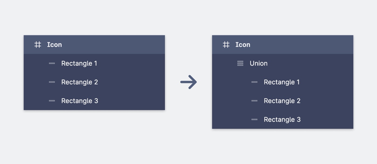 Combining your shapes into a boolean group in Figma
…and here's how that looks in code from Illustrator:
```html
```
## Setting up Duotone Icons
But it's a great, big, beautiful icon world out there! (Figuratively, of course — these icons are actually quite small.) Some Font Awesome styles aren't limited to just one SVG path, and yours shouldn't be either. To create a Font Awesome-friendly duotone icon, you can follow the same steps as above, but just make sure you have **two** separate compound paths (Illustrator) or nodes (Figma).
Those paths will form the two separate pieces of your icon, but our system needs one extra step to know to handle them differently: **opacity**.
Font Awesome Duotone icons use two levels of opacity (one for each part of the icon) to tell which is the **primary** layer and which is the **secondary** layer. Your primary layer should have an **opacity of 100%**, but you can set the secondary layer's **opacity to anything less than 100%**.
Combining your shapes into a boolean group in Figma
…and here's how that looks in code from Illustrator:
```html
```
## Setting up Duotone Icons
But it's a great, big, beautiful icon world out there! (Figuratively, of course — these icons are actually quite small.) Some Font Awesome styles aren't limited to just one SVG path, and yours shouldn't be either. To create a Font Awesome-friendly duotone icon, you can follow the same steps as above, but just make sure you have **two** separate compound paths (Illustrator) or nodes (Figma).
Those paths will form the two separate pieces of your icon, but our system needs one extra step to know to handle them differently: **opacity**.
Font Awesome Duotone icons use two levels of opacity (one for each part of the icon) to tell which is the **primary** layer and which is the **secondary** layer. Your primary layer should have an **opacity of 100%**, but you can set the secondary layer's **opacity to anything less than 100%**.
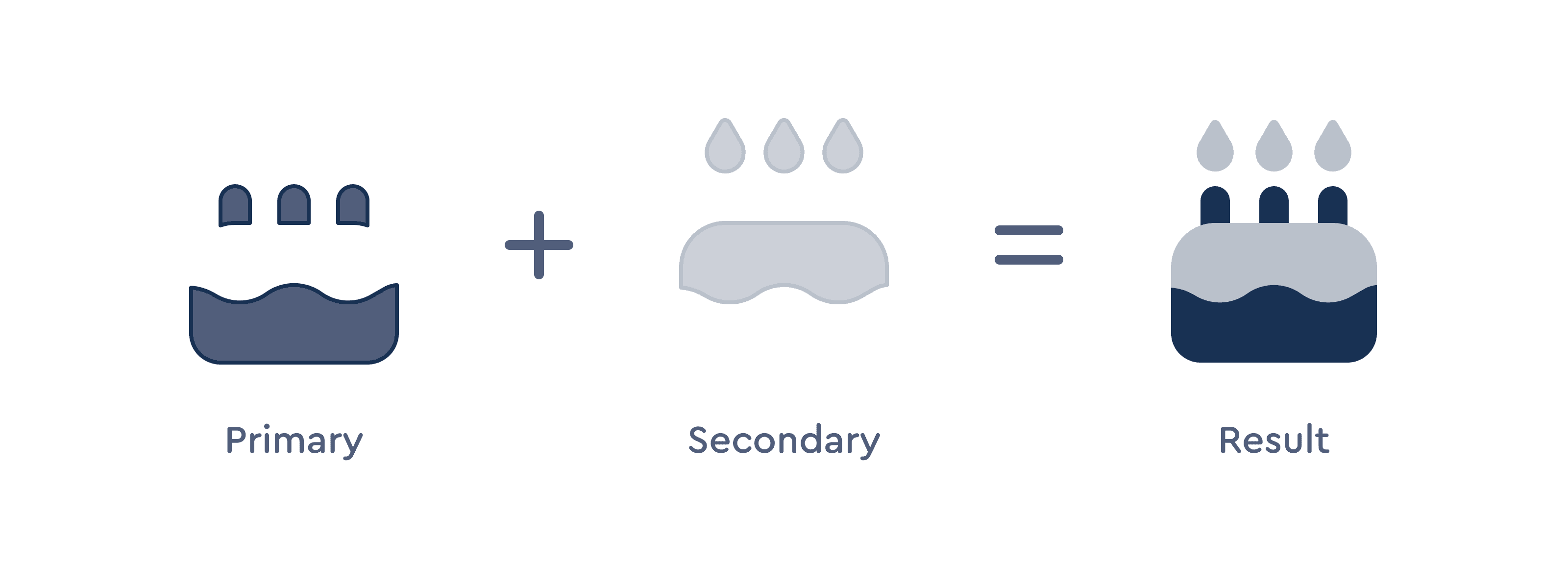 Diagram showing two separate pieces of a birthday cake icon, and how they don't overlap when combined -- two separate, non-overlapping paths for a duotone icon.
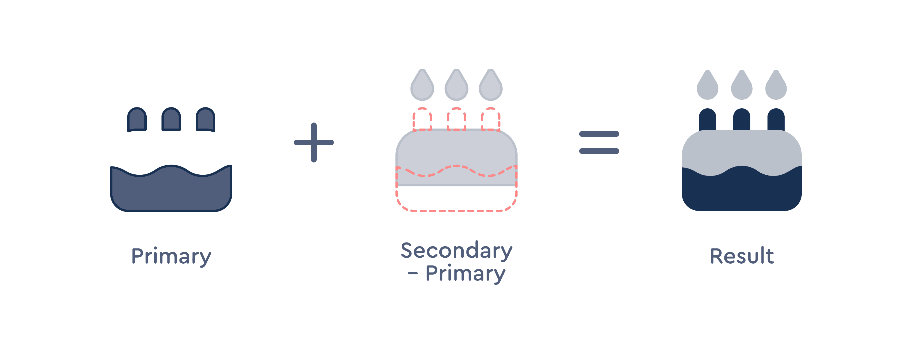 Diagram showing two overlapping pieces of a birthday cake icon, and how they interact when combined -- two separate, overlapping paths with a portion of the secondary layer being removed.
Regardless of how you decide to set up your opacity, the icon's secondary layer will be set to 40% once the icon is uploaded to match our Font Awesome icons. But after that, you can style it [however your heart desires](/web/style/duotone.md).
Diagram showing two overlapping pieces of a birthday cake icon, and how they interact when combined -- two separate, overlapping paths with a portion of the secondary layer being removed.
Regardless of how you decide to set up your opacity, the icon's secondary layer will be set to 40% once the icon is uploaded to match our Font Awesome icons. But after that, you can style it [however your heart desires](/web/style/duotone.md).
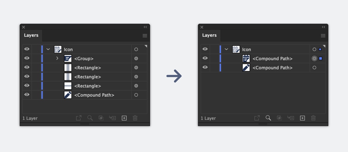 Combining your shapes into separate compound paths in Illustrator
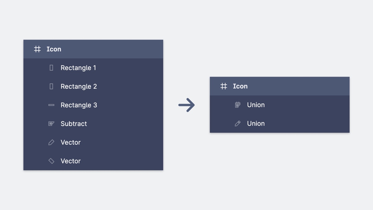 Combining your shapes into separate nodes in Figma
Here's an example of the above Sharp Duotone as an SVG. Notice the two separate path elements and that the second one has `opacity=".4"`
```html
```
## Exporting Icons from Adobe Illustrator
Check out the Font Awesome Icon Template for Illustrator!
1. Start with each of your icon designs in their own artboards.
2. Outline any strokes with **“Object → Path → Outline Stroke,”** and any text with **“Type → Create Outlines”**
3. When you're done designing, use **“Object → Compound Path → Make”** to combine your icon into either:
- One compound path (for [monotone](/web/add-icons/upload-icons/prep-icons.md#setting-up-monotone-icons))
- Two compound paths (one at 100% opacity, and one at < 100% opacity for [duotone](/web/add-icons/upload-icons/prep-icons.md#setting-up-duotone-icons)).
4. Use **“File → Export → Export for Screens”**, select the artboards you want to export, and choose **“Format → SVG”**. Also, click the little gear icon and use these SVG settings:
- Styling: **Presentation Attributes**
- Font: **Convert to Outlines**
- Object IDs: **Minimal**
- Decimal: **3**
- Check **“Minify”**
- Uncheck **“Responsive”**
5. Export the artboards to the location of your choice.
6. Upload your icons to a [Font Awesome Kit](https://fontawesome.com/kits)! ([Learn more](https://youtu.be/x7MZH7AVM7c))
## Exporting Icons from Figma
Check out the Font Awesome Icon Template for Figma!
1. Start with each of your icon designs in their own frames.
2. Outline any text or strokes, unless you're including them as part of a boolean group.
3. When you're done designing, use one of Figma's [boolean operations](https://help.figma.com/hc/en-us/articles/360039957534-Boolean-operations) to combine your icon into either:
- One vector node (for [monotone](/web/add-icons/upload-icons/prep-icons.md#setting-up-monotone-icons))
- Two vector nodes (one at 100% opacity, and one at < 100% opacity for [duotone](/web/add-icons/upload-icons/prep-icons.md#setting-up-duotone-icons)).
4. Select your icon frame(s) and click the **“Export”** section in the right sidebar. Choose **“SVG”** from the dropdown, and export the frames to the location of your choice.
5. Upload your icons to a [Font Awesome Kit](https://fontawesome.com/kits)! ([Learn more](https://youtu.be/x7MZH7AVM7c))
Combining your shapes into separate nodes in Figma
Here's an example of the above Sharp Duotone as an SVG. Notice the two separate path elements and that the second one has `opacity=".4"`
```html
```
## Exporting Icons from Adobe Illustrator
Check out the Font Awesome Icon Template for Illustrator!
1. Start with each of your icon designs in their own artboards.
2. Outline any strokes with **“Object → Path → Outline Stroke,”** and any text with **“Type → Create Outlines”**
3. When you're done designing, use **“Object → Compound Path → Make”** to combine your icon into either:
- One compound path (for [monotone](/web/add-icons/upload-icons/prep-icons.md#setting-up-monotone-icons))
- Two compound paths (one at 100% opacity, and one at < 100% opacity for [duotone](/web/add-icons/upload-icons/prep-icons.md#setting-up-duotone-icons)).
4. Use **“File → Export → Export for Screens”**, select the artboards you want to export, and choose **“Format → SVG”**. Also, click the little gear icon and use these SVG settings:
- Styling: **Presentation Attributes**
- Font: **Convert to Outlines**
- Object IDs: **Minimal**
- Decimal: **3**
- Check **“Minify”**
- Uncheck **“Responsive”**
5. Export the artboards to the location of your choice.
6. Upload your icons to a [Font Awesome Kit](https://fontawesome.com/kits)! ([Learn more](https://youtu.be/x7MZH7AVM7c))
## Exporting Icons from Figma
Check out the Font Awesome Icon Template for Figma!
1. Start with each of your icon designs in their own frames.
2. Outline any text or strokes, unless you're including them as part of a boolean group.
3. When you're done designing, use one of Figma's [boolean operations](https://help.figma.com/hc/en-us/articles/360039957534-Boolean-operations) to combine your icon into either:
- One vector node (for [monotone](/web/add-icons/upload-icons/prep-icons.md#setting-up-monotone-icons))
- Two vector nodes (one at 100% opacity, and one at < 100% opacity for [duotone](/web/add-icons/upload-icons/prep-icons.md#setting-up-duotone-icons)).
4. Select your icon frame(s) and click the **“Export”** section in the right sidebar. Choose **“SVG”** from the dropdown, and export the frames to the location of your choice.
5. Upload your icons to a [Font Awesome Kit](https://fontawesome.com/kits)! ([Learn more](https://youtu.be/x7MZH7AVM7c))