# The Icon Canvas

Details about the icon canvas and how Font Awesome icons are rendered.

> Learn how Font Awesome‘s icons are consistently rendered on the web and how to customize them to suit your project's needs.

Before we start, make sure you‘re:

- [Set up with Font Awesome](/web.md#web-setup) in your project.
- Familiar with the basics of [adding Font Awesome icons](/web/add-icons/how-to.md).

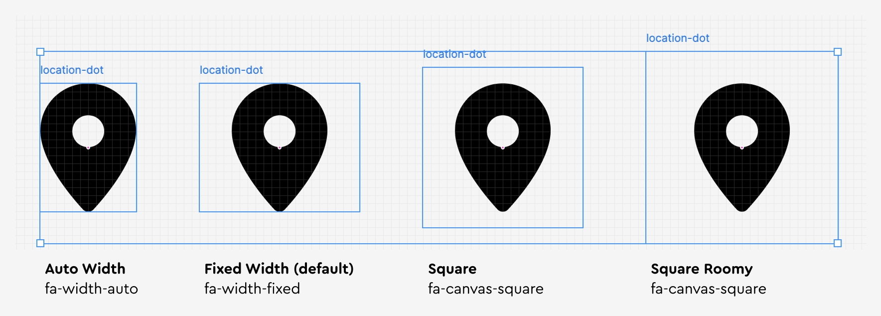
In order to keep them visually consistent, Font Awesome's icons have been designed using a **square 20 pixel grid**. We use that grid as an **“Icon Canvas”** and set an icon's proportions and position relative to it. We have a few options for sizing the canvas, and they mirror the options available in our [Figma plugin](/desktop/add-icons/figma-plugin.md) to make it easier for designers and developers to work together.

   Check out our <a href="/web/add-icons/upload-icons/icon-design.md">icon design guidelines</a> to learn more about the grid!

  <img
    slot="media"
    src="/web/style/images/canvas-sizing.png"
    alt="Canvas Sizes"
  />
  <span class="wa-card-image-description">
    Canvas Sizing Options
  </span>

| Name                                  | Class                                                        | Description                                                            |
| :------------------------------------ | :----------------------------------------------------------- | :--------------------------------------------------------------------- |
| [Auto Width](#automatic-width)        | <span style="white-space: nowrap;">`fa-width-auto`</span>    | Hugs the icon horizontally, height is 16px by default                  |
| [Fixed Width](#fixed-width) (default) | <span style="white-space: nowrap;">`fa-width-fixed`</span>   | Sets the icon canvas to 20px wide and 16px high with the icon centered |
| [Square](#square) \*                  | <span style="white-space: nowrap;">`fa-canvas-square`</span> | Sets the icon canvas to 20px high and wide with the icon centered      |
| [Roomy Square](#roomy-square) \*      | <span style="white-space: nowrap;">`fa-canvas-roomy`</span>  | Sets the icon canvas to 24px high and wide with the icon centered      |

Note: All pixel measurements above are assuming the default sizing - if you have sized your icons up or down, the canvas will scale proportionally.

<p>* Available in Version 7.3 and above</p>

## Fixed Width

By default, all Font Awesome icons on the web display at a fixed width which fills the entire Icon Canvas. Icons will be visually centered in the Canvas with balanced whitespace around them.

This default allows for easy alignment when using icons in a list or in subsequent vertical lines. And when placing icons horizontally next to each other, such as in an icon-based navigation, they will display at a consistent and uniform width.

  <div>
    <div><i class="fa-solid fa-bread-slice" style="background: LightSalmon;"></i> Bread</div>
    <div><i class="fa-solid fa-egg" style="background: LightSalmon;"></i> Eggs</div>
    <div><i class="fa-solid fa-cow" style="background: LightSalmon;"></i> Milk</div>
    <div><i class="fa-solid fa-apple-whole" style="background: LightSalmon;"></i> Apples</div>
    <div><i class="fa-solid fa-broccoli" style="background: LightSalmon;"></i> Broccoli</div>
  </div>

```html
<!-- vertically aligning icons -->
<div>
  <div>
    <i class="fa-solid fa-bread-slice" style="background: LightSalmon;"></i>
    Bread
  </div>
  <div>
    <i class="fa-solid fa-egg" style="background: LightSalmon;"></i>
    Eggs
  </div>
  <div>
    <i class="fa-solid fa-cow" style="background: LightSalmon;"></i>
    Milk
  </div>
  <div>
    <i class="fa-solid fa-apple-whole" style="background: LightSalmon;"></i>
    Apples
  </div>
  <div>
    <i class="fa-solid fa-broccoli" style="background: LightSalmon;"></i>
    Broccoli
  </div>
</div>
```

  <div class="fa-3x" style="display: flex; gap: 0.5rem;">
    <i class="fa-solid fa-backward" style="background: LightSalmon;"></i>
    <i class="fa-solid fa-play" style="background: LightSalmon;"></i>
    <i class="fa-solid fa-forward" style="background: LightSalmon;"></i>
    <i class="fa-solid fa-volume-xmark" style="background: LightSalmon;"></i>
    <i class="fa-solid fa-volume-low" style="background: LightSalmon;"></i>
    <i class="fa-solid fa-volume-high" style="background: LightSalmon;"></i>
    <i class="fa-solid fa-sliders" style="background: LightSalmon;"></i>
  </div>

```html
<!-- icon-based controls with consistent widths -->
<div class="fa-3x" style="display: flex; gap: 0.5rem;">
  <i class="fa-solid fa-backward" style="background: LightSalmon;"></i>
  <i class="fa-solid fa-play" style="background: LightSalmon;"></i>
  <i class="fa-solid fa-forward" style="background: LightSalmon;"></i>
  <i class="fa-solid fa-volume-xmark" style="background: LightSalmon;"></i>
  <i class="fa-solid fa-volume-low" style="background: LightSalmon;"></i>
  <i class="fa-solid fa-volume-high" style="background: LightSalmon;"></i>
  <i class="fa-solid fa-sliders" style="background: LightSalmon;"></i>
</div>
```

## Automatic Width

Add a class of `fa-width-auto` on the HTML element referencing your icon to **set its width to only the interior symbol and not the entire Icon Canvas**. This is great to use when you don't want extra whitespace around an icon, or you want to insert it inline with text.

<div class="fa-3x" style="display: flex; gap: 0.5rem;">
  <i class="fa-solid fa-exclamation fa-width-auto" style="background: LightSalmon;"></i>
  <i class="fa-solid fa-circle-check fa-width-auto" style="background: LightSalmon;"></i>
  <i class="fa-solid fa-input-numeric fa-width-auto" style="background: LightSalmon;"></i>
  <i class="fa-solid fa-ruler-vertical fa-width-auto" style="background: LightSalmon;"></i>
  <i class="fa-solid fa-ruler-horizontal fa-width-auto" style="background: LightSalmon;"></i>
  <i class="fa-solid fa-airplay fa-width-auto" style="background: LightSalmon;"></i>
</div>

```html
<!-- icons with automatic widths -->
<div class="fa-3x" style="display: flex; gap: 0.5rem;">
  <i class="fa-solid fa-exclamation fa-width-auto" style="background: LightSalmon;"></i>
  <i class="fa-solid fa-circle-check fa-width-auto" style="background: LightSalmon;"></i>
  <i class="fa-solid fa-input-numeric fa-width-auto" style="background: LightSalmon;"></i>
  <i class="fa-solid fa-ruler-vertical fa-width-auto" style="background: LightSalmon;"></i>
  <i class="fa-solid fa-ruler-horizontal fa-width-auto" style="background: LightSalmon;"></i>
  <i class="fa-solid fa-airplay fa-width-auto" style="background: LightSalmon;"></i>
</div>
```

  <h4>
    Extras in Our Examples

  </h4>

For clarity in the above examples, we've added a background color on each icon and some simple layout styling.

### Automatic Width by Default

If you want to set all icons to render using Automatic Width rather than the default Fixed Width, you can do so via the following ways.

#### Set the Automatic Width Class

Add a class of `fa-width-auto` on the HTML element and icons that are nested in that part of the [DOM](https://developer.mozilla.org/en-US/docs/Web/API/Document_Object_Model) will inherit that class' rule. If you want this setting applied at the project level, add that class on the `<body>` element or somewhere central in your templates.

```html
<!-- all icons on the page will render using Automatic Width -->
<body class="fa-width-auto">
  ...
</body>
```

```html
<!-- all icons in this HTML section will render using Automatic Width -->
<section class="fa-width-auto">...</section>
```

#### Using CSS Custom Properties

You can alternatively set Font Awesome's included `--fa-width` [CSS custom property](/web/style/customizing-icons.md) in your app or site's CSS.

```css
/* set '--fa-width' custom property to 'auto' */
:root {
  --fa-width: auto;
}
```

```css
/* set '--fa-width' custom property to 'auto' for an element with the .my-section class*/
.my-section {
  --fa-width: auto;
}
```

  <h4>
    A Warning about Width-Wizarding

  </h4>

We've set the default width of Fixed Width-rendered icons to be the equivalent of 20 pixels (based on the default web browser font size of 16 pixels).

While it is possible to override this via the `--fa-width` custom property with unique values, doing so may introduce rendering issues. If you customize this, double-check that your changes have the intended effect.

## Adjusting Canvas Sizing

There are also two options for adding padding to our icon canvas, Square and Roomy Square.

New!

### Square

Add a class of `fa-canvas-square` on the HTML element referencing your icon to make the canvas height and width the same. Padding is around the icon to make it fit within the square. This matches the Square sizing in our [Figma plugin](/desktop/add-icons/figma-plugin.md). Available in Version 7.3 and above.

<div class="fa-3x" style="display: flex; gap: 0.5rem;">
  <i class="fa-solid fa-exclamation fa-canvas-square" style="background: LightSalmon;"></i>
  <i class="fa-solid fa-circle-check fa-canvas-square" style="background: LightSalmon;"></i>
  <i class="fa-solid fa-input-numeric fa-canvas-square" style="background: LightSalmon;"></i>
  <i class="fa-solid fa-ruler-vertical fa-canvas-square" style="background: LightSalmon;"></i>
  <i class="fa-solid fa-ruler-horizontal fa-canvas-square" style="background: LightSalmon;"></i>
  <i class="fa-solid fa-airplay fa-canvas-square" style="background: LightSalmon;"></i>
</div>

```html
<!-- icons with square widths -->
<div class="fa-3x" style="display: flex; gap: 0.5rem;">
  <i class="fa-solid fa-exclamation fa-canvas-square" style="background: LightSalmon;"></i>
  <i class="fa-solid fa-circle-check fa-canvas-square" style="background: LightSalmon;"></i>
  <i class="fa-solid fa-input-numeric fa-canvas-square" style="background: LightSalmon;"></i>
  <i class="fa-solid fa-ruler-vertical fa-canvas-square" style="background: LightSalmon;"></i>
  <i class="fa-solid fa-ruler-horizontal fa-canvas-square" style="background: LightSalmon;"></i>
  <i class="fa-solid fa-airplay fa-canvas-square" style="background: LightSalmon;"></i>
</div>
```

New!

### Roomy Square

Add a class of `fa-canvas-roomy` on the HTML element referencing your icon to add padding all around the icon. This is great to use when you want to set the icon off as an independent design element. This matches the Roomy sizing in our [Figma plugin](/desktop/add-icons/figma-plugin.md). Available in Version 7.3 and above.

<div class="fa-3x" style="display: flex; gap: 0.5rem;">
  <i class="fa-solid fa-exclamation fa-canvas-roomy" style="background: LightSalmon;"></i>
  <i class="fa-solid fa-circle-check fa-canvas-roomy" style="background: LightSalmon;"></i>
  <i class="fa-solid fa-input-numeric fa-canvas-roomy" style="background: LightSalmon;"></i>
  <i class="fa-solid fa-ruler-vertical fa-canvas-roomy" style="background: LightSalmon;"></i>
  <i class="fa-solid fa-ruler-horizontal fa-canvas-roomy" style="background: LightSalmon;"></i>
  <i class="fa-solid fa-airplay fa-canvas-roomy" style="background: LightSalmon;"></i>
</div>

```html
<!-- icons with roomy square widths -->
<div class="fa-3x" style="display: flex; gap: 0.5rem;">
  <i class="fa-solid fa-exclamation fa-canvas-roomy" style="background: LightSalmon;"></i>
  <i class="fa-solid fa-circle-check fa-canvas-roomy" style="background: LightSalmon;"></i>
  <i class="fa-solid fa-input-numeric fa-canvas-roomy" style="background: LightSalmon;"></i>
  <i class="fa-solid fa-ruler-vertical fa-canvas-roomy" style="background: LightSalmon;"></i>
  <i class="fa-solid fa-ruler-horizontal fa-canvas-roomy" style="background: LightSalmon;"></i>
  <i class="fa-solid fa-airplay fa-canvas-roomy" style="background: LightSalmon;"></i>
</div>
```

## Icon Height and Visual Padding

While designed on visual grids with 20 or more units, our software displays and vertically centers icons in an element with a base rendering height equivalent of `1em` (out of the box, that's the default `16px` that most browsers set). This display and centering is what makes aligning them with text on the web super easy.

To achieve visual balance across our collection, some of our icons leverage more of the visual grid and have parts that vertically extend outside of that base rendering height when rendered - such as our `-slash` icons.

<div class="fa-3x" style="display: flex; gap: 0.5em; align-items: center; font-family: system-ui;">
  <i class="fa-solid fa-file" style="background: LightSalmon;"></i>
  <i class="fa-solid fa-file-slash" style="background: LightSalmon;"></i>
  <i class="fa-solid fa-eye" style="background: LightSalmon;"></i>
  <i class="fa-solid fa-eye-slash" style="background: LightSalmon;"></i>
  <i class="fa-solid fa-toilet-paper-under" style="background: LightSalmon;"></i>
  <i class="fa-solid fa-toilet-paper-under-slash" style="background: LightSalmon;"></i>
</div>

<br />

For example, at a `font-size` equivalent to `48px`, our [file](https://fontawesome.com/icons/file) icon is exactly `48px` tall. The [file-slash](https://fontawesome.com/icons/file-slash) icon is also `48px` tall — at least, _optically_. The `-slash` element slightly extends past the top and bottom of the base height.

This makes both icons equally tall visually. We call this extra extended vertical space **"Icon Padding"** (not to be confused with [CSS padding](https://developer.mozilla.org/en-US/docs/Web/CSS/padding)).

### Cropping Issues with Icon Padding

There are some conditions where this Icon Padding can become visually cropped if you have:

1. an icon inside an HTML element that is just as tall as the icon
1. `overflow: hidden` applied via CSS to that parent HTML element

In those conditions, make sure you allow the Icon Padding to be visible by slightly increasing the element's computed height - either with a larger `line-height`, or `padding-top` and `padding-bottom`. The Square and Roomy Square canvas options can prevent the icon from being visually cropped.

<div style="display: flex; gap: 0.5em; align-items: center; font-family: system-ui;">
  <div style="font-size: 48px; line-height: 1; overflow: hidden; background: LightSalmon; margin-top: 0;">
    <i class="fa-solid fa-file"></i>
  </div>

  <div style="font-size: 48px; line-height: 1; overflow: hidden; background: LightSalmon; margin-top: 0;">
    <i class="fa-solid fa-file-slash" style="color: var(--wa-color-danger-on-quiet);"></i>
  </div>

  <div style="font-size: 48px; line-height: 1; overflow: hidden; background: LightSalmon; margin-top: 0;">
    <i class="fa-solid fa-file-slash" style="color: var(--wa-color-success-on-quiet); line-height: 1.2;"></i>
  </div>

  <div style="font-size: 48px; line-height: 1; overflow: hidden; background: LightSalmon; margin-top: 0;">
    <i class="fa-solid fa-file-slash" style="color: var(--wa-color-success-on-quiet); padding-top: 0.1em; padding-bottom: 0.1em"></i>
  </div>
</div>

```html
<!-- this <div> and the following ones will all have a visual height of 48px thanks to font-size and line-height  -->
<div style="font-size: 48px; line-height: 1; overflow: hidden; background: LightSalmon;">
  <!-- fa-file does not render into the Icon Padding -->
  <i class="fa-solid fa-file"></i>
</div>

<div style="font-size: 48px; line-height: 1; overflow: hidden; background: LightSalmon;">
  <!-- fa-file-slash's Icon Padding is visually cut off -->
  <i class="fa-solid fa-file-slash"></i>
</div>

<div style="font-size: 48px; line-height: 1; overflow: hidden; background: LightSalmon;">
  <!-- accounting for fa-file-slash's Icon Padding with extra line-height -->
  <i class="fa-solid fa-file-slash" style="line-height: 1.2;"></i>
</div>

<div style="font-size: 48px; line-height: 1; overflow: hidden; background: LightSalmon;">
  <!-- accounting for fa-file-slash's Icon Padding with vertical padding -->
  <i class="fa-solid fa-file-slash" style="padding-top: 0.1em; padding-bottom: 0.1em"></i>
</div>
```

  <h4>
    Other Cases with Cropping

  </h4>

A similar visual cropping may also occur if you're using [SVG Sprites](/web/add-icons/svg-sprites.md#visually-cropped-icons), [Bare SVGs](/web/add-icons/svg-bare.md#visually-cropped-icons), or [Animating Icons in Safari](/web/style/animate.md#safari-bug-with-animating-icons).