Duotone Icons
Our new duotone style provide a version of every icon in Font Awesome that has two distinct shades of color. They’re great for adding more of your brand or an illustrative quality to the icons in your project.
Using SVGs
Section titled “Using SVGs”If you’d like to use duotone icons on the desktop, we currently recommend using the duotone-specific optimized .svg vector files. These can be found in the /svgs/duotone folder of your “Font Awesome Pro for the Desktop” download. While the ligature-based font files we include are usually the easiest way to go, there are some technical limitations when it comes to multi-layered icons.
Adding a Duotone SVG Icon
In a desktop design application that supports working with .svg files, open any of the individual duotone SVG icons found in /svgs/duotone. You should see an SVG shape that contains two distinct layers.
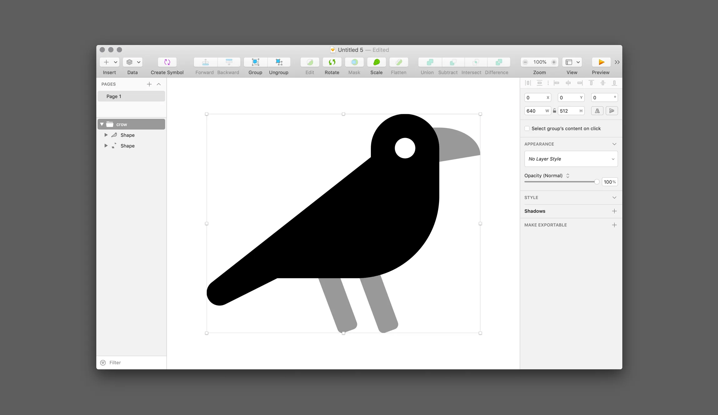
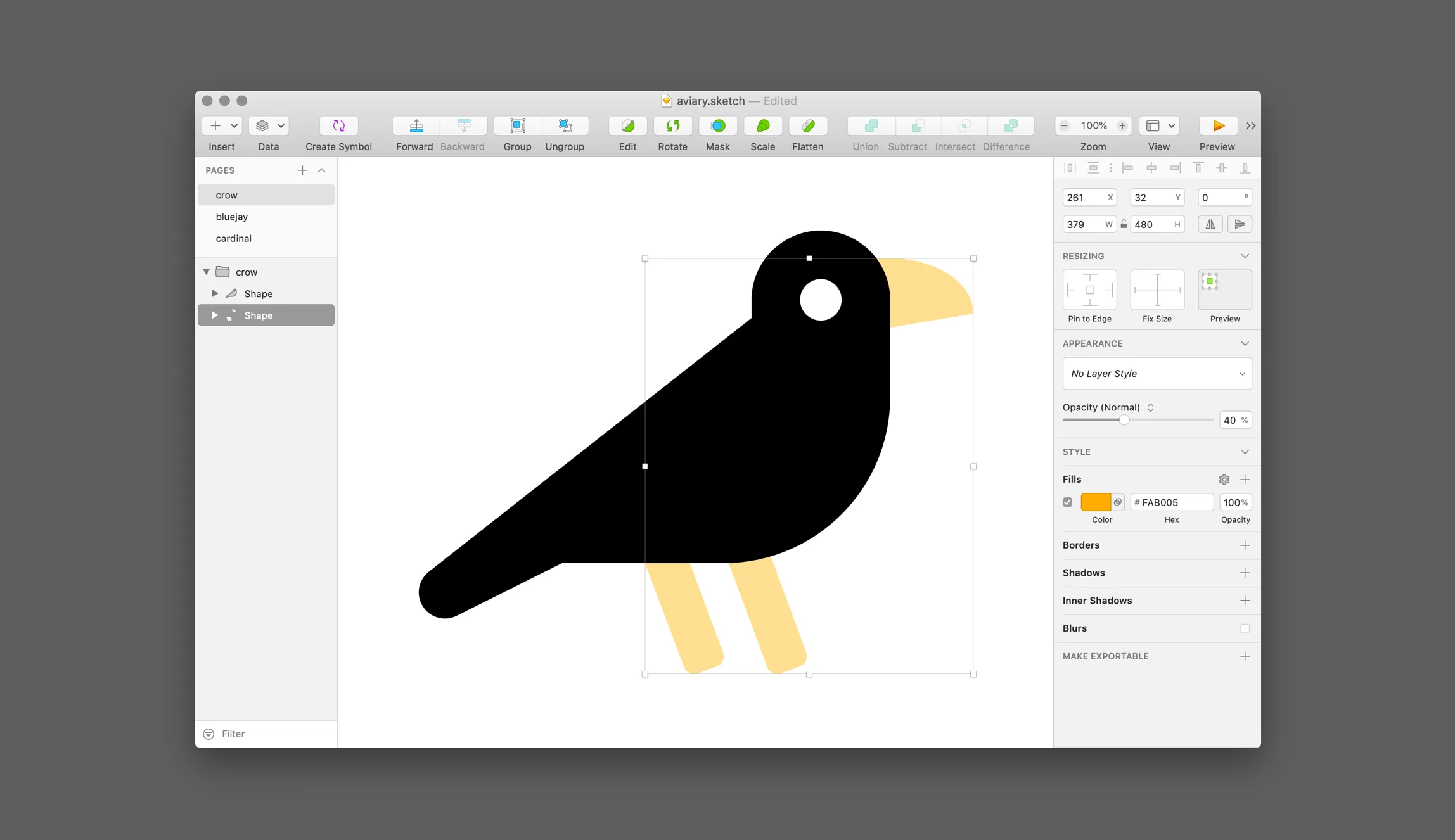
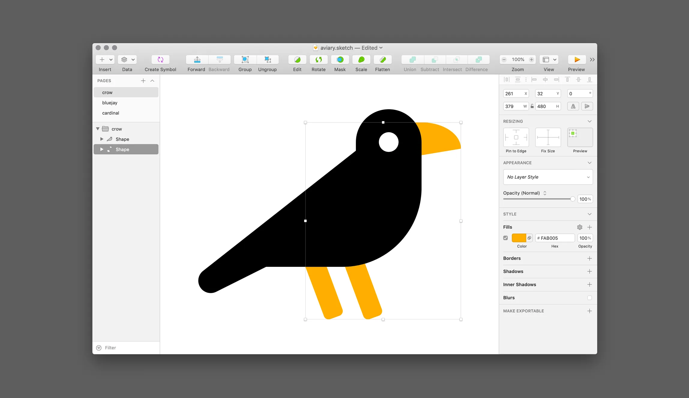
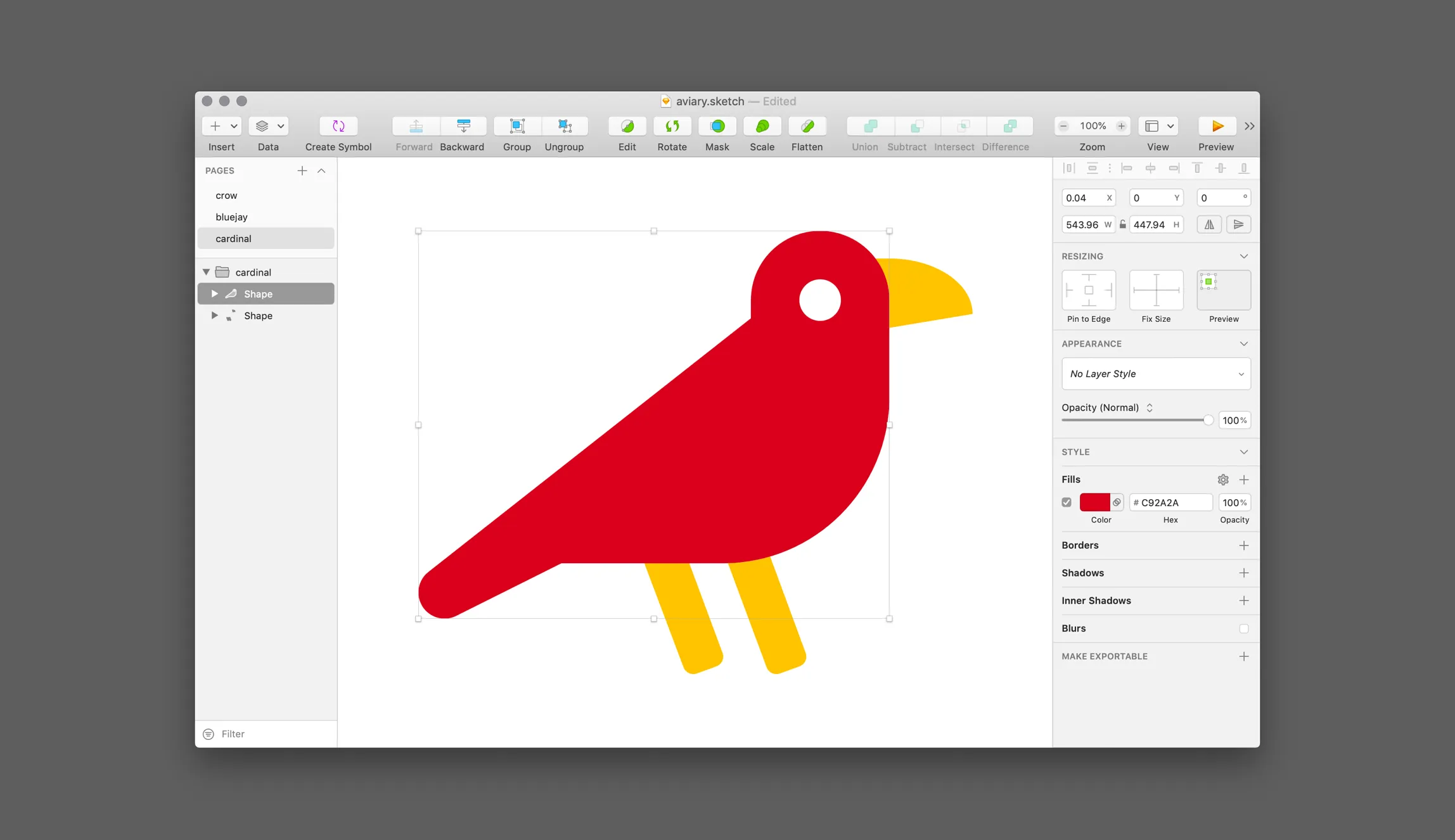
Changing Layer Colors and Opacity Once open, you can manipulate the opacity and color of individual layers in the SVG you opened.
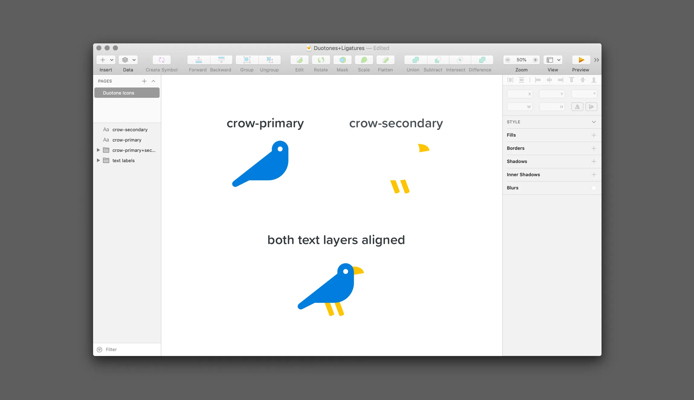
Using Ligatures
Section titled “Using Ligatures”After downloading “Font Awesome Pro for the Desktop”, you can find and install and activate the duotone style at /otfs/Font Awesome 5 Duotone-Solid-900.otf. The duotone typeface works like our other ligature-based .otf fonts once installed and activated. There is one big difference however. Each icon’s layer has been split into two separate glyphs, a primary and a secondary. You’ll need to reference each in a separate text layer and then visually align those layers.
| Duotone Icon | Separate Layers and Glyphs Needed |
|---|---|
crow | crow-primary and crow-secondary |
pizza | pizza-primary and pizza-secondary |
french-fries | french-fries-primary and french-fries-secondary |
Why have we separated duotone icons into two glyphs in the font file?
If you’ve followed the OpenType spec you may know about SVG in OpenType. It allows colors, gradients, opacity and generally all the available options of the SVG format to be embedded in an OpenType font file. You are already familiar with this technology if you’ve ever used an emoji on your Android or iPhone device. If you haven’t used an emoji, seriously; what have you been doing on your phone?
We experimented with this technology while we were adding the duotone feature and found it had one major drawback: it doesn’t inherit color. In desktop apps that we tried (Photoshop, Illustrator, and Sketch) the opacity worked well but the icons always remained a boring gray, unable to be changed unless you broke it up into outlines. This ability to inherit color is supposed to work and does in most Internet browsers. In desktop apps, though, it trips over its shoelaces and face-plants into failure.