Icon Design Guidelines
With a few key concepts in mind, you can create great looking custom icons that will fit right in and be able to use all the awesome of Font Awesome.
Font Awesome’s icons have been designed for easy use in digital interfaces so they’ve been optimized for legibility alongside the default web browser font size of 16 pixels. In order to create pixel-perfect and visually consistent icons, we design all of our icons using a 16 pixel-based icon grid and default shape guidelines.
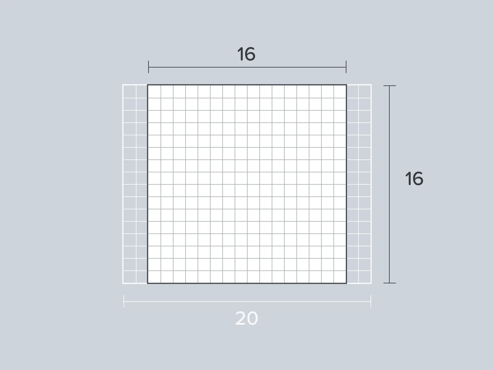
That icon grid sets a base width and height of 16 pixels by 16 pixels. The grid has an additional 4 pixel horizontal overflow to accommodate icons with a wider footprint.
 The Font Awesome 16 pixel grid has built in horizontal overflow (taking its max width to 20 pixels)
Shapes on the Grid
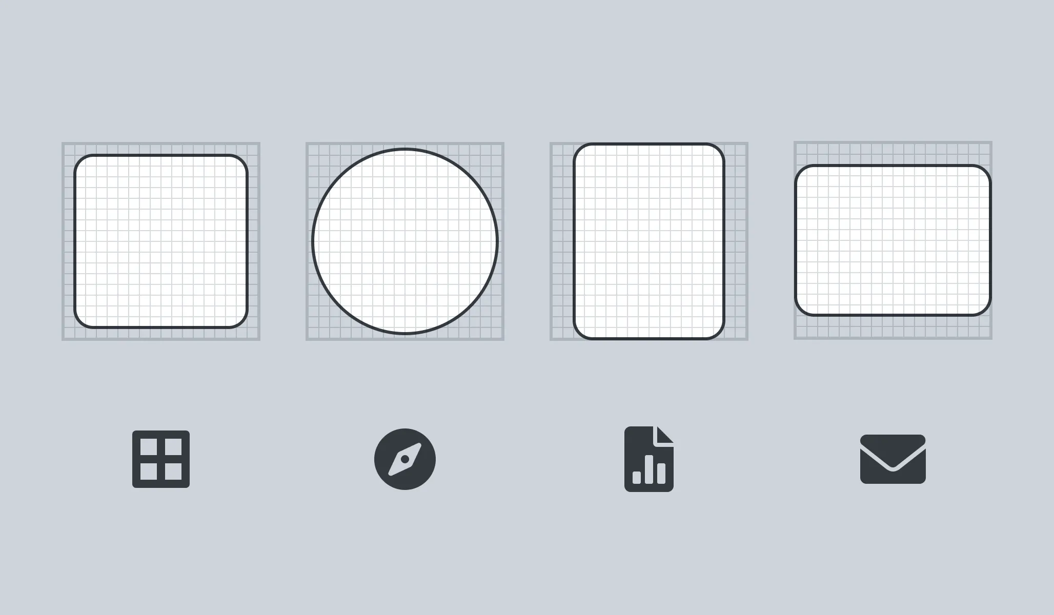
Section titled “Shapes on the Grid”We’ve defined the size of shapes (such as circles, squares, and rectangles) using our icon grid.
 Our square, circle, vertical rectangle, and horizontal rectangle paired with icons that are based on each shape
When making your own icons using our icon grid, you’ll want to keep these shapes in mind and even recreate their sizes directly.
| Shape | Size |
|---|---|
| Square | 14 pixels by 14 pixels |
| Circle | 15px diameter |
| Rectangle (Vertical) | 12 pixels by 16 pixels |
| Rectangle (Horizontal) | 16 pixels by 12 pixels |
Font Awesome Grid
Section titled “Font Awesome Grid”When you upload your own icons to a kit, we’ll translate that icon onto our icon grid. We do this to ensure uploaded icons’ size and appearance will look right at home when side-by-side with official Font Awesome icons. Using our grid and guidelines when designing your own icon goes a long way to making that translation accurate and easy.
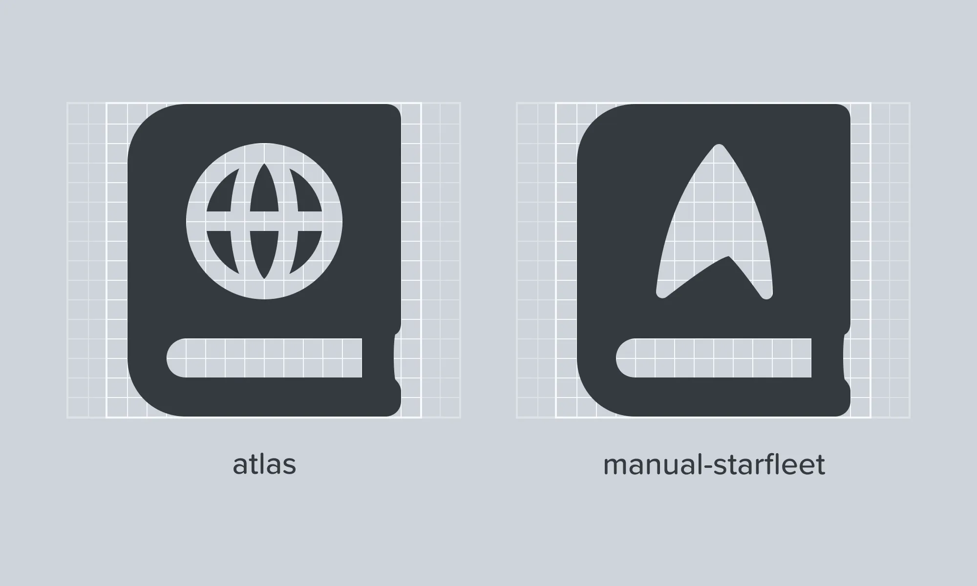
 Using our grid system, you can make design choices that are consistent with official Font Awesome icons (and even extend official icons like the one above)