Prep Icons for Upload
To help your icons display nicely alongside official Font Awesome icons, follow these requirements when preparing your SVGs for upload.
Valid SVGs
Section titled “Valid SVGs”We only accept SVG files when uploading icons to a kit. These SVGs must be valid and well-formed. If we can’t parse through your SVG to understand its content, then we can’t confidently translate it into an icon.
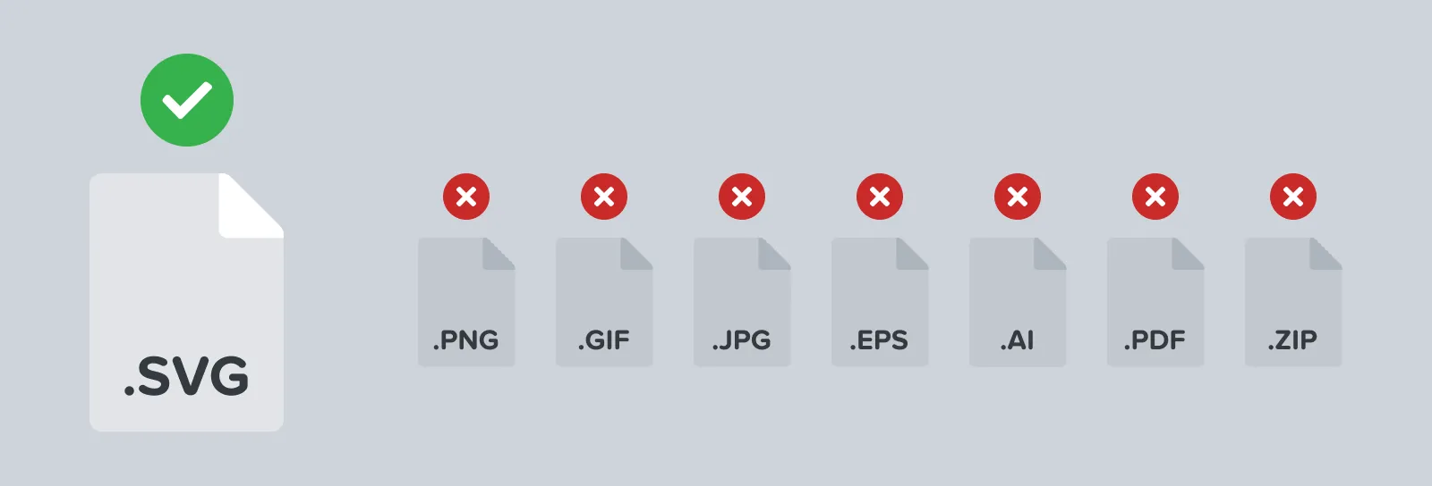 You can only upload SVG files as icons to a kit
To be valid, SVGs must have the following:
| Requirements | Why |
|---|---|
One path element | We’ll be using this one path, which represents your icon’s shape, to create an icon from. Multiple paths are not accepted. |
a viewBox attribute | The viewbox attribute acts like (and is often derived from) an artboard in design software. It defines the physical width and height an icon will take up when rendered digitally. |
an xmlns="http://www.w3.org/2000/svg" attribute | This official XML namespace value is needed to help validate your SVG against the general schema, or rulebook, for the file type. |
a viewbox with a min-y and min-x value of 0 | Your SVG’s viewbox cannot start offset horizontally or vertically. Your icon’s path, however, can be placed anywhere inside of the viewbox |
a viewbox with a width value | This property tells us how wide your icon is |
a viewbox with a height value | This property tells us how tall your icon is |
Here’s our solid circle icon’s valid SVG code…
<svg xmlns="http://www.w3.org/2000/svg" viewBox="0 0 16 16"> <path d="M15.5,8A7.5,7.5,0,1,1,8,.5,7.5,7.5,0,0,1,15.5,8Z"/></svg>Use a Viewbox (a.k.a. Artboard)
Section titled “Use a Viewbox (a.k.a. Artboard)”A viewbox is the canvas an icon is set on. Both an icon’s size and alignment are informed by its viewbox. The path representing your icon must be placed completely in a viewbox with no points lying outside of its boundaries. We’ll ignore any paths or shapes that are outside of the viewbox.
If you’re using design software to create icons, the viewbox attribute can be taken directly from the dimensions of your file’s artboard when exporting SVGs.
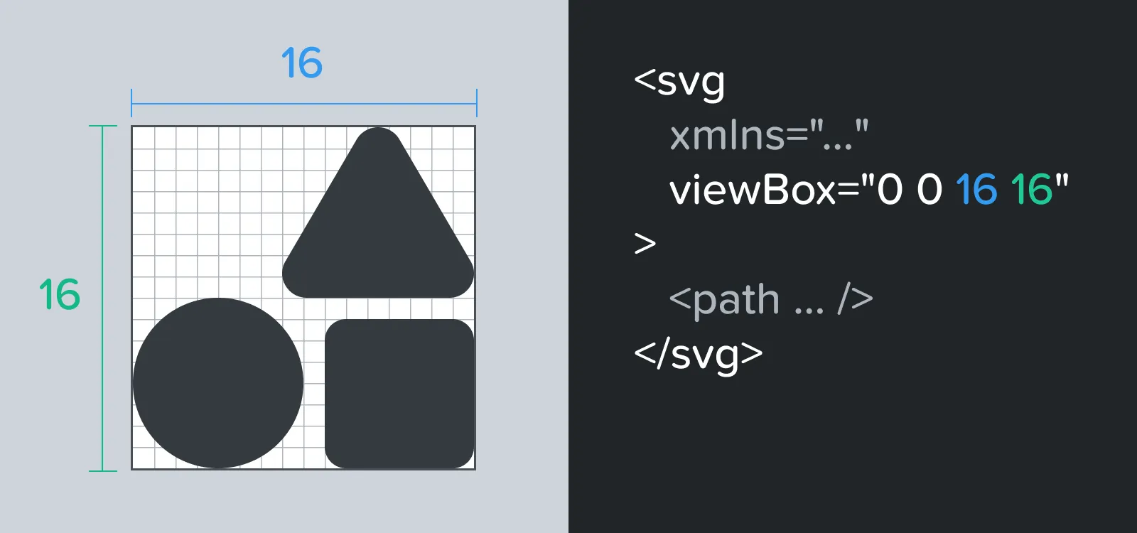 The width and height of an artboard is directly translated into an SVG’s minX and minY values
Use a Single Path
Section titled “Use a Single Path”Official Font Awesome icons are created from one single path. If your icon is visually comprised of multiple paths (e.g. a radio and broadcast waves or a square with a plus visually knocked out of it), you’ll need to join them into one compound path.
Paths that overlap each other In the case that paths overlap each other, you’ll need to combine the paths into one path using the union, subtract, intersect, or exclude tools that come with your design software. Adobe Illustrator bundles these in their pathfinder tool.
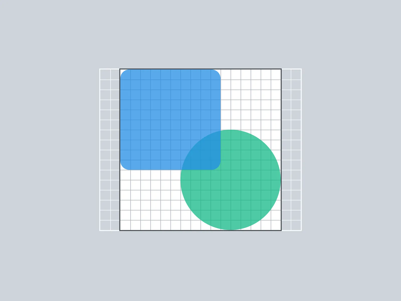 Combine paths that overlap each other on an icon grid
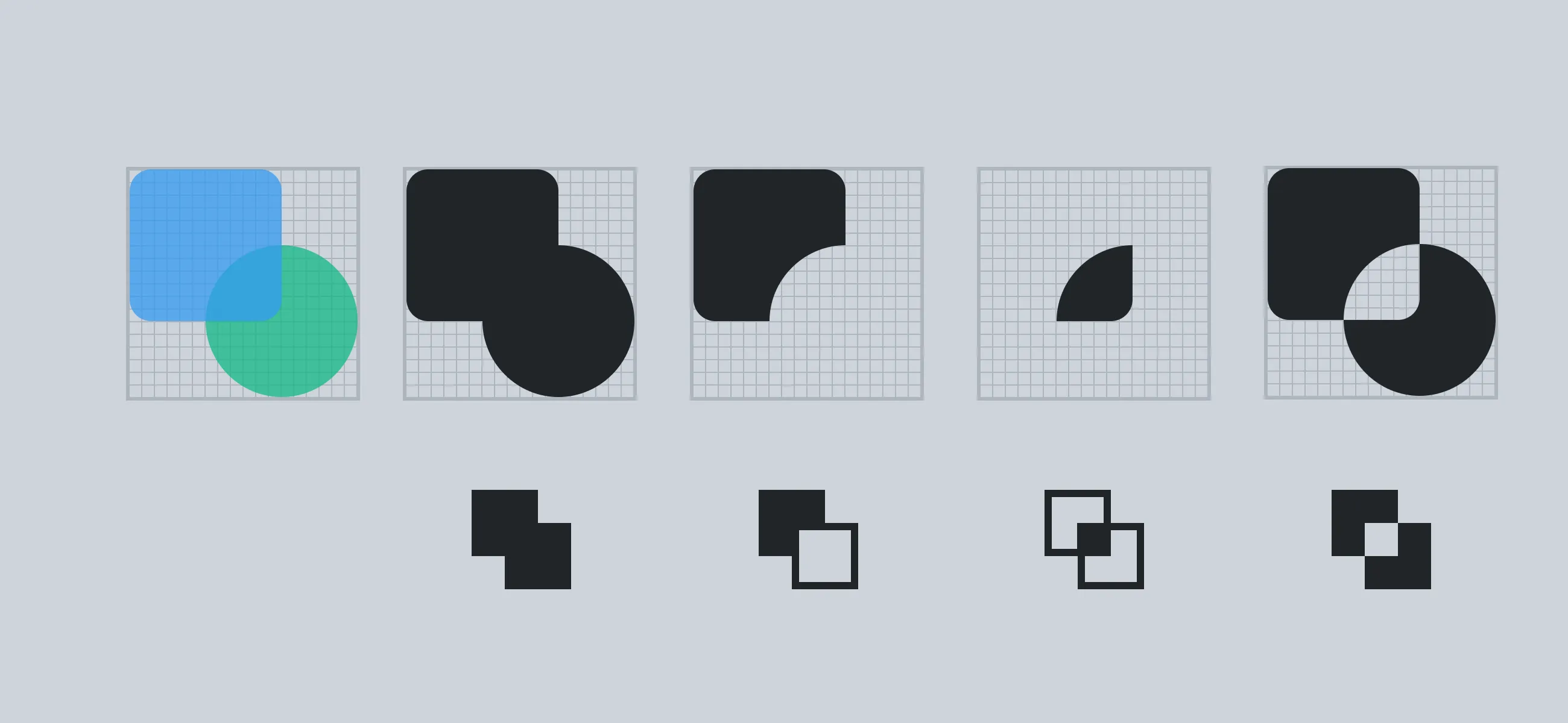 And here are outcomes when combining paths using Unite, Minus Front, Intersect, and Exclude respectively
| Combination Type | Outcome |
|---|---|
| “Union” or “Unite” | Takes all selected shapes and turns them into a single path. |
| “Subtract Selection” or “Minus Front” | Will remove whatever shape overlaps in front. |
| “Intersect” | Will keep any overlap between the two original shapes. |
| “Exclude” | The exact inverse of “Intersect”. Any overlap between the two original shapes will be removed |
Paths that do not overlap In the case of an icon with two or more separate paths, you’ll need to select all of the paths and choose the “Object → Compound Path → Make” in Adobe Illustrator.
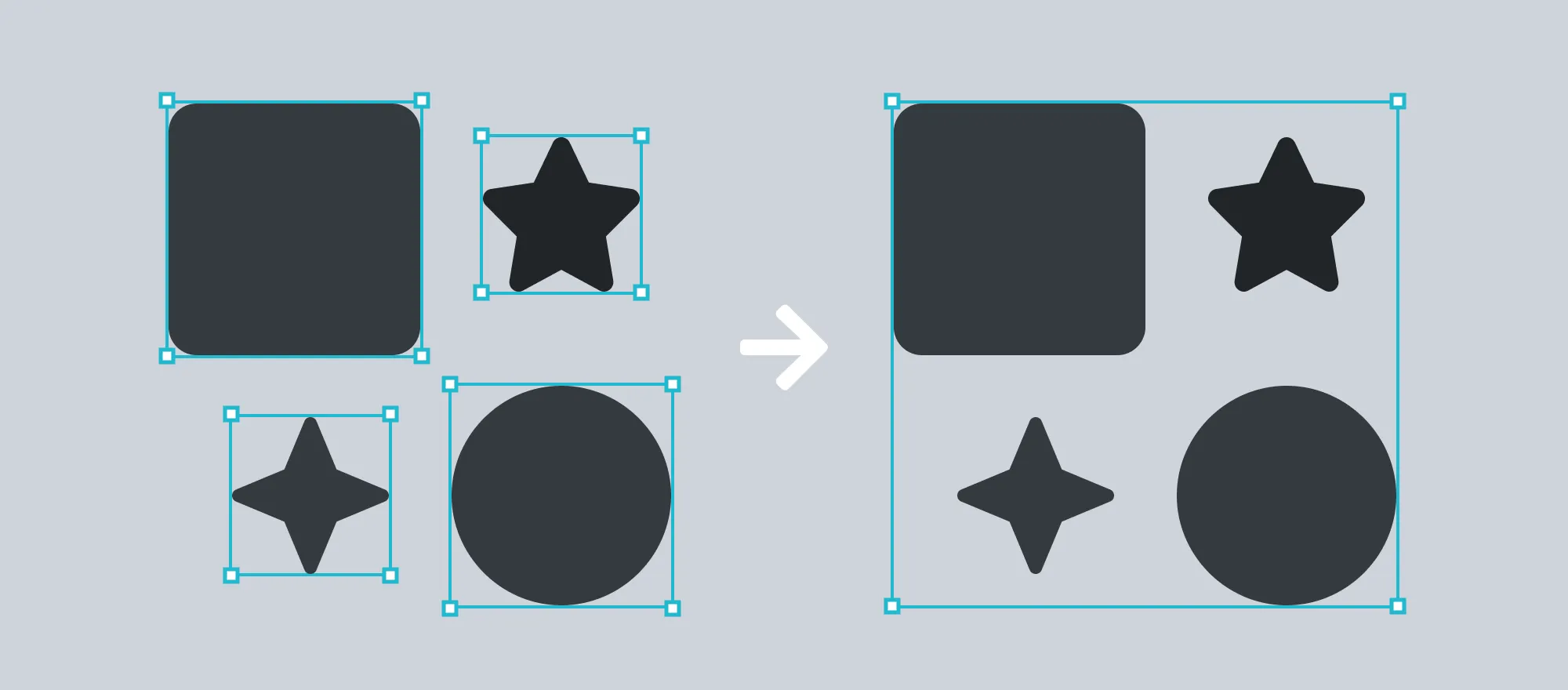 Left: four distinct paths (for each shape). Right: those same four paths joined into one compound path.
Expand All Strokes to Paths
Section titled “Expand All Strokes to Paths”Strokes that you’ve placed on paths won’t scale properly when icons are resized throughout your UI. They also cause legibility issues at certain scales and aren’t great at supporting pixel-perfect rendering on the web.
In Adobe Illustrator, you can use the “Object → Path → Outline Stroke” command to convert a stroke into its own path. In other vector editing apps, this can be done by selecting the paths and choosing “Convert to Outlines”.
 Left: a path with a stroke. Right: The same path with the stroke expanded.
Convert All Typefaces to Paths
Section titled “Convert All Typefaces to Paths”Typefaces referenced in SVGs depend on the system rendering them to provide the typeface. You can’t expect your project’s users to have the typefaces you’re using available on their system. In addition typefaces won’t scale properly when icons are resized throughout your UI and hit the same legibility and pixel-perfect rendering woes as noted above.
In Adobe Illustrator and many vector editing apps, you can select a text layer or path and use the “Type → Create Outlines” command.
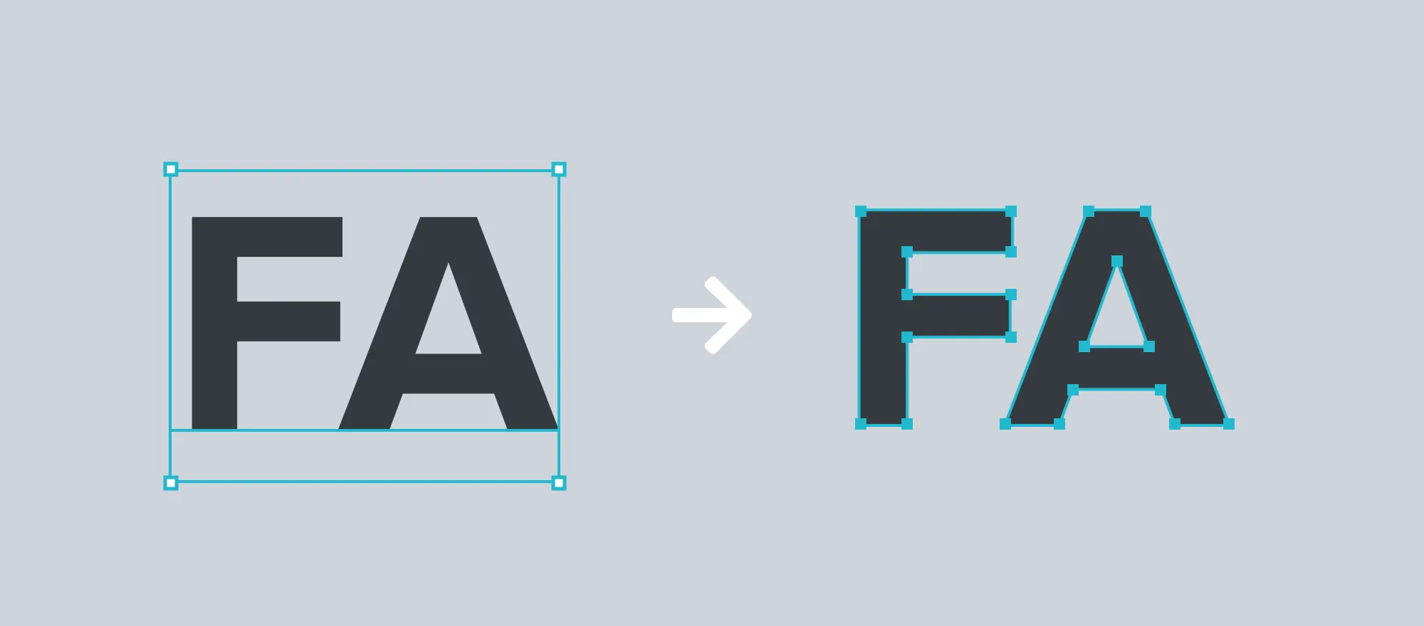 Left: A type layer. Right: The same type layer converted to a path.
Don’t Use SVG Shapes
Section titled “Don’t Use SVG Shapes”SVG supports drawing some shapes by name (e.g. circle, rectangle, line, polygon). Shapes that are converted into paths mean all SVG content is consistent and easier to work with.
In Adobe Illustrator, you can use the “Object → Compound Path → Make” menu to convert a shape into a path.
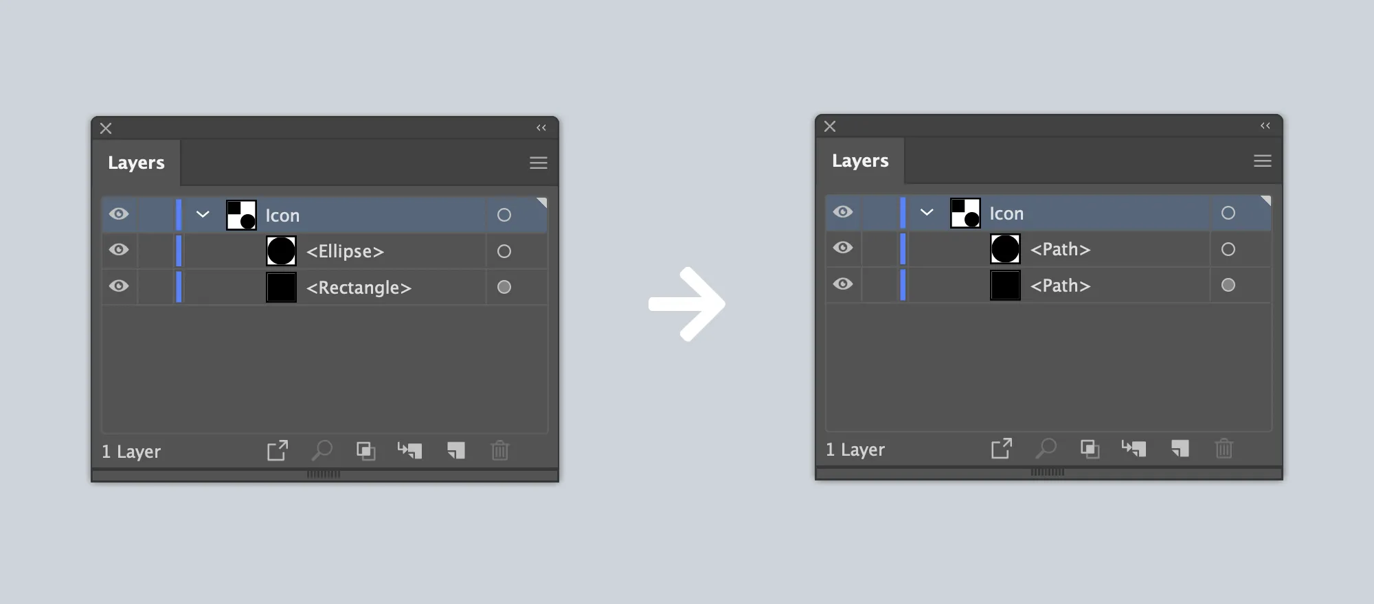 Left: SVG shapes in Adobe Illustrator’s layers menu. Right: Those shapes converted to a compound path.
Don’t Include Raster Images
Section titled “Don’t Include Raster Images”SVGs are the ideal medium for icons on the web because they scale very well in almost any context. Conversely, raster images such as PNGs, JPGs, and GIFs, do not. Additionally, raster images that are referenced in an SVG cause extra file size and are prone to scaling and rendering issues.
Ungroup All Paths
Section titled “Ungroup All Paths”SVGs support grouping paths (using the <g> element). For the purposes of icons, this can cause unnecessary complexity and rendering issues if there is excessive grouping.
Be sure to ungroup all paths, even when you are at the point of having a single path. Most vector editing apps allow you to do this with an “Ungroup” command. By using the “Object → Compound Path → Make” command in Illustrator, all groups will automatically be removed from your SVG.
Use a Single Color to Fill Paths
Section titled “Use a Single Color to Fill Paths”Uploaded icons currently only allow a single color. The fill or color of your icon nor its opacity do not matter at the time of upload - we’ll only be looking at and translating the path of the SVG.
Stick to a single color when designing icons. If you often also use opacity to confirm that paths have been joined properly, but always set it back to 100% before moving forward with uploading.
Use Precise Measurements
Section titled “Use Precise Measurements”Icons that render pixel-perfectly have their path’s points set deliberately on an icon grid. They also use consistent values for shapes, angles, and edges. All of this information is eventually communicated through points (or coordinates) an SVG’s viewbox.
As such, make sure the points of your path are exactly where you want them. Double-check that the X and Y coordinates of each point on your path are correct. Also, confirm that any border radius numbers along the edges of your path are using the exact values you’ve set. When exporting from design software (see below), make sure you’ve set your decimal precision to at least 3 places to maintain that level of detail.
Exporting SVGs from Design Software
Section titled “Exporting SVGs from Design Software”When exporting vectors as SVGs from design software such as Adobe Illustrator, you’ll want to make sure you do the following in any menus or export settings:
- Set any styling to be “Internal CSS”. Better yet, remove styling all together if you can.
- Set your vector’s precision values to include at least 3 decimal places
- Remove any
idorclassattributes if possible. They’re not needed. - Remove any
fillattributes. - Select any “minify” or “optimize” flags to produce an SVG as lean and simple as possible.
After you’ve exported your icon as an SVG, we recommend opening it in a code or text editor to see the details of your software’s export. You can manually tackle any of the suggestions above that your software didn’t cover.